
_Pollux writes_:
Some _New Yorker_ covers require some explanation, and this is certainly the case with the cover for the May 10, 2010 issue of _The New Yorker_. _Sempé Fi_ is here to help.
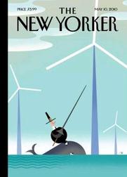
Bob Staake’s “Tilt” features a Pilgrim riding a whale tilting a lance at a wind farm in the middle of the ocean. The imagery, and title, refer to Don Quixote. The focus of the cover, however, is on the waters off Massachusetts (hence the Pilgrim) rather than the sun-drenched fields of La Mancha. Specifically, the covers refers to the controversial Cape Wind project, the United States’ first offshore wind farm.
Composed of 130 wind turbines, Cape Wind is to be built on Horseshoe Shoal in Nantucket Sound. Public opinion survey results reveal that most Bay Staters support the project and its goal of providing clean, renewable energy, but opponents include the Alliance to Protect Nantucket Sound, which cites economic, environmental, and aesthetic concerns.
Greenpeace, however, supports Cape Wind, and has its own concerns about the Alliance to Protect Nantucket Sound, “accusing”:http://www.greenpeace.org/usa/campaigns/global-warming-and-energy/copy-of-wind-power/in-support-of-cape-wind/greenpeace-support-s-cape-wind the organization of disseminating false and misleading information about the Cape Wind project. Greenpeace alleges, for example, that the Alliance of falsely tripled the size of Cape Wind in the Alliance’s description of the controversial project, as well as depicting Cape Wind to be much closer to shore than it would be.
Interestingly, the wording that the _Boston Globe_ used for its coverage on this distortion evokes Staake’s imagery: “Foes tilt at larger-than-life Cape Windmills – Error in flier inflates the size of proposed turbine farm in Nantucket Sound.”
And so the battle rages. Staake’s round little Pilgrim tilts a lance at a towering wind turbine, but it is an ineffective lance.
Both the Pilgrim and the whale are dwarfed by the powerful-looking and triumphant towers of Aeolus. The Pilgrim’s old fashioned weapon and clothing evokes the futile and somewhat backward-looking opposition to the Cape Wind project. “It is easy to see,” Don Quixote says to Sancho just before battling the windmills, “that you are not used to this business of adventures. Those are giants, and if you are afraid, away with you out of here and betake yourself to prayer, while I engage them in fierce and unequal combat.”
_Cape Cod Today_ “interviewed”:http://www.capecodtoday.com/blogs/index.php/2010/05/03/cape-wind-makes-new-yorker-cover?blog=53 Staake regarding this cover. “Like most of us here on the Cape,” Staake remarked, “I have mixed feelings about the project and I think the cover reflects that, though I have to say I think it’s pretty cool that in a few years my Chatham studio will be powered by wind.”
Would any future disaster involving Cape Wind reach the magnitude and create the damaged wreaked by the Deepwater Horizon disaster? Are wind farms beautiful to look at? Would sea life be adversely affected by the presence of a wind turbine?
In any case, the debate may be moot: Ken Salazar, the Secretary of the Interior, gave the project the green light in late April. Staake’s whale-riding, lance-wielding Pilgrim cuts a silly figure against a backdrop of turbines slicing the sky.
As with any major development project, there are pros and cons, mixed feelings, rational opposition, irrational opposition, strong support, and fierce and sometimes unequal combat. Bob Staake’s “Tilt” captures the spirit of this combat and debate.
Author Archives: Paul
The Wavy Rule, a Daily Comic by Pollux: Parallel Parking
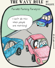
Click on the image for a detailed view!
The Wavy Rule, a Daily Comic by Pollux: Crabby
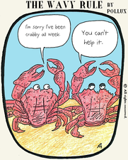
Click on the image for a detailed view!
The Wavy Rule, a Daily Comic by Pollux: Semicolon Shirts

Click on the image for a detailed view!
The BP Logo: Emblem of an Evil Empire

_Pollux writes_:
You’ve seen it in the news a lot recently. You’ve seen it online. It graces the sides of unsafe oil rigs. It’s the BP logo.
The sunburst logo debuted in 2000 in an explosion of green, white, yellow. The logo unveiling was accompanied by mythological references to Helios, the Greek god of the sun (and the father of Phaëton, who irresponsibly set the earth on fire).
Greenpeace rightfully mocked the logo after its debut. Margarit Ralev “writes”:http://logoblink.com/2009/06/18/greenpeace-laughs-at-bp-logo/ about an incident in which Greenpeace handed out fake copies of the _International Herald Tribune_ at a summit in Brussels.
The newspaper included a satirical BP advertisement that proclaimed: “When we greened our identity, we felt confident that cosmetic changes would be enough.”
Corporate logos are tied to identity, but they reveal nothing about a company beyond the image they wish to project. Cosmetic changes are meaningless without management, structural and safety modifications that would have avoided, for example, the Deepwater Horizon disaster. When dictators come to power, they change flags, coins, country names, and city names, and care much less about improving the lot of their people.
Cosmetic changes are simply easier. It’s much easier to change one’s stationary than it is to reform Station 42872 (“Deepwater Horizon”).
And now the Gulf of Mexico isn’t seeing friendly sunrays of green and yellow, only an ocean of fire, gooey emissions, and dead porpoises. We don’t see sunbursts on the news, only burst pipes.
_Star Wars’_ evil Galactic Empire also had a logo:
![]()
Perhaps it’s time for BP to perform another redesign:

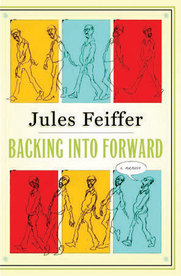
(Review) Back to Back: Jules Feiffer’s Backing Into Forward
_Pollux writes_:
On a recent trip to New York, I was accompanied by Jules Feiffer’s autobiography, Backing Into Forward (published by Nan A. Talese). Between snatches of fitful, airborne sleep and occasional glances at a muted version of _Hachiko: A Dog’s Story_, Feiffer’s book served as a great and inspiring companion.
_Backing Into Forward_ can be read non-linearly. Feiffer’s book reads less like a traditional autobiography than a collection of self-contained, stand-alone essays. Like Feiffer’s comic strips for _The Village Voice_, each piece throws light on a particular anxiety, time period, or person. _Backing Into Forward_ has chapters named, for example, “The Jewish Mother Joke,” “Hackwork,” “Mimi,” “Lucking Into the Zeitgeist,” and “Process.”
The chapter named “Process,” for example, consists of a single page. Feiffer describes his process for arriving–or not arriving–at a completed comic strip. “I’d be humming along nicely–and then I’d arrive at what should have been the last panel without a thought in my head. I didn’t know how to end the thing. So I’d stash the idea in a drawer and forget it. A year or ten or twenty-five went by and, searching for something else, I’d come across the unfinished idea. Thirty seconds later the ending would announce itself. I’d draw it and send it in. Twenty-five years in the making: a comic strip.”
Feiffer skips backward and forward into time as he writes about his childhood in the Bronx, his journey to the West Coast and back again as a hitchhiker, his time in the army, his mother, his rise to fame, and his entry into the world of comics via work as Will Eisner’s gopher and subsequent ghost writer. As he tells it, Feiffer was a wimpy kid who found refuge in the world of comics. As a young man, he was tongue-tied and awkward around women. Feiffer is funny and honest about what fame did to his relations with women: now _they_ had to nervously come up with an opening line if they wanted to talk to him.
The same distinctive voice that reverberates through _Sick Sick Sick_ and _Feiffer_ is here: Feiffer is both acerbic and candid about his childhood, talent, family, doubts and frustrations (both sexual and creative), and fears (most of all, his fears). But it is an autobiography about hope and determination as well: nothing, not even a Korean War-era draft, an overbearing mother, or heartbreak- could stop Feiffer’s goal of becoming a comics artist.
Feiffer’s work appeared often in The New Yorker, but, interestingly, he writes that it was the dream of newspaper work that propelled him towards his goal. “Although I had been an admirer of _The New Yorker_ since childhood, the magazine had never played a part in how I worked or thought about work… [A]s much as I loved the work of Peter Arno, Charles Addams, Whitney Darrow, George Price, Helen Hokinson, Gluyas Williams, Alan Dunn, Sam Cobean, Frank Modell, and other _New Yorker_ regulars, I could not imagine myself appearing in their magazine.”
It is his candor that made his comics, plays, children’s stories, and screenplays unique and mordant examinations of American Anxiety from the Vietnam era to our present decade. Feiffer is still relevant. His “Obama! Ourbama!”:http://www.jeanalbano-artgallery.com/feiffer-exhibit/feiffershow.html print captures the optimism that took hold of many of us at the beginnings of 2009, sizeable shreds and shards of which still remain.
_Backing Into Forward_ includes many illustrations and photographs, and it ends with three pages of drawings in a chapter called “Last Panels.” Feiffer, in tux and top hat, ends with a _Sick Sick Sick_-style farewell: “Now the great thing about being a cartoonist…is that you can draw yourself as anyone you like….So excuse me…As I finish my dance.”
Sempé Fi: Out With the Old
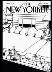
_Pollux writes_:
The work of Bruce Eric Kaplan, also known by the shorthand of BEK, graces both the inside and the outside of the May 3 issue of _The New Yorker_. That’s quite a coup for an artist “who”:http://www.mediabistro.com/articles/cache/a1455.asp used to live “in a space that was meant to hold just one car and maybe some old boxes or tools or whatever it is people put in (half of) a garage” and submitted cartoons to _The New Yorker_ for three years before one was accepted.
Kaplan’s cartoon (on page 60) is about people watching a thriller about bunny rabbits (“Don’t go into that hole!”). His cover, called “Spring Cleaning,” depicts the act of clearing out the clutter from a suburban house.
Part of the clutter on the curb consists of items like an old washer, sofa, and lamp, as well as another old relic: the cleaner’s husband. The husband’s attachment to his rocking chair, which has suffered the same fate, symbolizes the inertia and dotage that led to his being discarded in the first place.
The spring cleaner grins in triumph; she has rid herself of some dusty and useless items, perhaps to be replaced by newer models. The long winter is over.
In “Spring Cleaning,” Kaplan retains the distinctive style of his cartoons: the boxy, pupil-less figures with the starfish stance, the heavy blacks and lack of grays and washes, and the off-kilter and dark humor.
Kaplan wrote one of my favorite _Seinfeld_ episodes, “The Cartoon.” This episode satirized the “typical _New Yorker_ cartoon,” in which a frustrated and confused Elaine accuses the _New Yorker’s_ cartoon editor of simply running doodles of “a couple of bears at a cocktail party talking about the stock market.”
Kaplan’s cartoons are of course not about bears at a cocktail party talking about the stock market, but are set in a slightly skewed reality in which reality and our darkest thoughts intersect. Kaplan’s cover is set in a surreal suburban landscape, in which the old station wagon is parked in the driveway and the paterfamilias is parked on the curb.
The gag cover would work just as well as a 4 inch by 4 inch cartoon within the magazine’s pages, but its presence on the cover gives us a refreshing, black-and-white slice of BEK’s brain at the very beginning.
The Wavy Rule, a Daily Comic by Pollux: Crowe is Copernicus
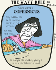
Click on the image for a detailed view!
The Wavy Rule, a Daily Comic by Pollux: The Mixed Metaphors
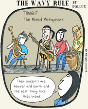
The band in the drawing was inspired by my recent attendance at a show at The Mint in Los Angeles. The band in question was “Mahndo”:http://www.myspace.com/1amandadumas, whose lead singer is Amanda Dumas. They were great.
Click on the image for a detailed view!
Wikivamp: Wikipedia’s New Look
_Pollux writes_:
Wikipedia looks different today. That’s because the Wikimedia Foundation has revamped the site, including “redesigning”:http://blog.wikimedia.org/2010/05/13/wikipedia-in-3d/ its “puzzle globe” logo.
Now we have improved search suggestions, so if you start to type in, for example, the word “punctuation,” you get the suggestions below.

What is “Punctuation (chess)”? Acccording to the article, chess commentators use punctuation marks to designate whether a chess move was bad or good.
The Google-like search suggestions are definitely an improvement. Google in fact donated two million dollars to Wikipedia in February. Google’s own collaborative encyclopedia, Google Knol, at its release dubbed a “Wikipedia killer,” is not even guilty of minor assault.
For editors, Wikipedia has revamped the toolbar designed to make editing much easier and intuitive. Wikipedia is encouraging feedback, and has a submission form at their New Features section.
A revamp of Wikipedia was inevitable as the online encyclopedia reached maturity. Whether the revamp is a real improvement or just a series of cosmetic changes remains to be seen, but to use my newfound knowledge of chess punctuation, **!?** (interesting move).