
_Pollux writes_:
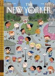
Double issue of _Sempé Fi_ today. Now we’re going to look at Ivan Brunetti’s cover for the May 31, 2010 issue of _The New Yorker_. It’s called “Union Square,” and depicts this New York landmark crowded with Brunetti’s typically diminutive, big-headed figures (Brunetti’s covers are easily recognizable). Even Henry Kirke Brown’s 1856 equestrian statue of George Washington is re-imagined in Brunettian form.
Union Square is usually the focal point for political protests. Brunetti’s Union Square has many people, but only of them can be described as a protestor: she wars a bandanna and holds a sign calling for the ban of something.
The point Brunetti is making is that the call for political action is drowned out by multiple iPods, Bluetooths, and headphones and the steady uproar of daily life. A man strums a guitar, a ponytailed yuppie whizzes by on a Segway, kids play, a man in a purple dinosaur suit hands out ads. As if emphasizing his point, Brunetti’s cover depicts the strings of a large guitar on its left margin. Brunetti’s lone protestor is engulfed by the park and by the skyline.
Who is listening to the protestor? No one. No one is up in arms because everyone’s arms are full with the needs and rhythms of daily life.
Category Archives: Sempé Fi
Sempé Fi: Boomerang

_Pollux writes_:
“Parents groan about the ‘boomerang’ generation,” Gerald Handel and Gail G. Whitchurch write in _The Psychosocial Interior of the Family_, “young adults who return to the nest and stay beyond the time when, in years past, they would have been expected to be independent. Parents send their kids out, but they keep coming back.”
And certainly the parents featured on Daniel Clowes’ cover for the May 24, 2010 issue of _The New Yorker_ look dismayed to see the return of their adult son. Clowes’ cover, called “Boomerang Generation,” refers to a social phenomenon of our time: grown children, often college graduates, who are retying the apron strings.
Clowes depicts an amusing but credible scene: a student, having recently earned his PhD, hanging his diploma alongside past triumphs from his elementary and high school days. The student has returned home; he is surrounded by luggage and boxes. Tim is once again occupying “Tim’s Room.” Parents, keep out (unless you’re there to collect laundry or trash).
His parents look on, saddened and disappointed. Perhaps they had hoped to turn “Tim’s Room” into a gym or a room they could rent out.
What now for Clowes’ newly minted graduate? Will he sit around, getting his laundry done by maternal hands and visiting his old haunts? Will he reflect on how small his bedroom feels compared to the campus dorm he shared with two roommates from Uruguay and Taiwan, respectively? What will he do with his dissertation on Livonian peasant culture?
The trend of a Boomerang Generation, which merits an entry in the _Encyclopedia of Social Problems_ (it comes after “Body Image”), is linked to multiple causes: young adults marrying later, fewer employment opportunities, the high cost of housing.
But for whom is this a problem? The parents or the children? For the children, becoming a boomerang seems less of a social problem and more of a solution. It makes economic sense. Whether the children become psychologically stunted or not, the thought of how much money is being saved cancels out any possible paraphilic infantilism or diaper fetishism.
For the parents, having their children return home may or may not be a cause for strife. As Vincent N. Parrillo writes in his _Encyclopedia of Social Problems_, “the unhappiest parents are those whose children have left and returned on several occasions, returning because of failure in the job market or in pursuit of education.”
We can lump the parents that Clowes depicts into that category of “unhappiest parents.” But they should not despair. Tim is finding his own way, and one day, while driving past his old high school (“Go Wildcats”), an idea or flash of inspiration will strike him, and he will embark on a new life’s journey.
Sempé Fi: The Thin Black Line

_Pollux writes_:
The May 17, 2010 issue of _The New Yorker_ was The Innovators Issue. The issue’s cover, called “Novel Approach,” by the Dutch artist “Joost Swarte”:http://www.joostswarte.com/, captures the process of invention and inspiration, and the insanity that drives them both.
In the 17th and 18th centuries, scientists and thinkers were obsessed with solving the problem of longitude. In our own day, we are concerned with solving the issue of global warming.
In “Novel Approach,” Swarte gives us a wordless comic in his trademark _ligne claire_ style. As Sean Rogers elegantly “put it”:http://www.walrusmagazine.com/blogs/2009/06/16/joost-swarte-further-summer-reading/, “Swarte’s drawings communicate so clearly because they’re executed in so concise and direct a fashion. Clarity of line engenders clarity of thought: each line set to paper acts as one element among equals, like a term in a balanced equation, or a word in a sentence that comes quickly but elegantly to the point.”
In “Novel Approach,” however, we are presented with a series of drawings that are open to various interpretations. Are we following a linear story, or, unguided by captions or balloons, can we start at any point in a series of panels that symbolize the fits and starts of innovation?
If we take a closer look at Swarte’s drawings, I believe there is a linear story here. It is the story of global warming and man’s tardy efforts to solve this problem.
Swarte’s hero, a bald, bespectacled man, is reading a newspaper -which perhaps is running stories on the issues of climate change. While he does so, numerous forms and shapes, all black in color, hover, enshroud, inspire, or approach Swarte’s hero.
Black smoke in various forms and increasing intensity emerges from the man’s pipe; from a passing car; from a large truck. In the second row of panels, black smoke belches forth from a factory.
In the next illustration, the man is alarmed by the levels of bovine flatulence. Do cow farts cause global warming? According to “The Straight Dope”:http://www.straightdope.com/columns/read/832/do-cow-and-termite-flatulence-threaten-the-earths-atmosphere, “animal methane does present a definite threat to the biota. It’s believed 18 percent of the greenhouse effect is caused by methane, putting it second on the list of offending gases behind carbon dioxide.”
In the next drawing, a black sun angrily glares at the man, who is engrossed in his newspaper. The sun is warmer and more dangerous.
In the third row, we see the effects of global warming: emigrating penguins; a large, black tidal wave, symbolizing the increased threat of tsunamis; and flooding. Swarte’s hero wades through black waters. It doesn’t seem to disturb him; in fact, it is moving him closer to an idea.
In the last row, he gets a flash of inspiration while swimming underwater. The world is perhaps covered by a Panthalassic Ocean.
His idea? A propeller beanie (also colored black) that will allow him to read his newspaper in peace amongst the clouds. Will it come to that? Swarte’s hero does not solve the issue of global warming at all; his novel approach, which is also the surreal approach of a mad fool, is simply to sit atop the clouds while our world turns into a water planet.
Swarte’s clean lines provide us with a future that is all too frightening in its clarity. Will we take action before it’s too late or will we all drown in an angry sea cluttered with empty cans and dead fish?
Sempé Fi: Winds of Change
_Pollux writes_:
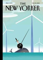
Some _New Yorker_ covers require some explanation, and this is certainly the case with the cover for the May 10, 2010 issue of _The New Yorker_. _Sempé Fi_ is here to help.
Bob Staake’s “Tilt” features a Pilgrim riding a whale tilting a lance at a wind farm in the middle of the ocean. The imagery, and title, refer to Don Quixote. The focus of the cover, however, is on the waters off Massachusetts (hence the Pilgrim) rather than the sun-drenched fields of La Mancha. Specifically, the covers refers to the controversial Cape Wind project, the United States’ first offshore wind farm.
Composed of 130 wind turbines, Cape Wind is to be built on Horseshoe Shoal in Nantucket Sound. Public opinion survey results reveal that most Bay Staters support the project and its goal of providing clean, renewable energy, but opponents include the Alliance to Protect Nantucket Sound, which cites economic, environmental, and aesthetic concerns.
Greenpeace, however, supports Cape Wind, and has its own concerns about the Alliance to Protect Nantucket Sound, “accusing”:http://www.greenpeace.org/usa/campaigns/global-warming-and-energy/copy-of-wind-power/in-support-of-cape-wind/greenpeace-support-s-cape-wind the organization of disseminating false and misleading information about the Cape Wind project. Greenpeace alleges, for example, that the Alliance of falsely tripled the size of Cape Wind in the Alliance’s description of the controversial project, as well as depicting Cape Wind to be much closer to shore than it would be.
Interestingly, the wording that the _Boston Globe_ used for its coverage on this distortion evokes Staake’s imagery: “Foes tilt at larger-than-life Cape Windmills – Error in flier inflates the size of proposed turbine farm in Nantucket Sound.”
And so the battle rages. Staake’s round little Pilgrim tilts a lance at a towering wind turbine, but it is an ineffective lance.
Both the Pilgrim and the whale are dwarfed by the powerful-looking and triumphant towers of Aeolus. The Pilgrim’s old fashioned weapon and clothing evokes the futile and somewhat backward-looking opposition to the Cape Wind project. “It is easy to see,” Don Quixote says to Sancho just before battling the windmills, “that you are not used to this business of adventures. Those are giants, and if you are afraid, away with you out of here and betake yourself to prayer, while I engage them in fierce and unequal combat.”
_Cape Cod Today_ “interviewed”:http://www.capecodtoday.com/blogs/index.php/2010/05/03/cape-wind-makes-new-yorker-cover?blog=53 Staake regarding this cover. “Like most of us here on the Cape,” Staake remarked, “I have mixed feelings about the project and I think the cover reflects that, though I have to say I think it’s pretty cool that in a few years my Chatham studio will be powered by wind.”
Would any future disaster involving Cape Wind reach the magnitude and create the damaged wreaked by the Deepwater Horizon disaster? Are wind farms beautiful to look at? Would sea life be adversely affected by the presence of a wind turbine?
In any case, the debate may be moot: Ken Salazar, the Secretary of the Interior, gave the project the green light in late April. Staake’s whale-riding, lance-wielding Pilgrim cuts a silly figure against a backdrop of turbines slicing the sky.
As with any major development project, there are pros and cons, mixed feelings, rational opposition, irrational opposition, strong support, and fierce and sometimes unequal combat. Bob Staake’s “Tilt” captures the spirit of this combat and debate.
Sempé Fi: Out With the Old
_Pollux writes_:
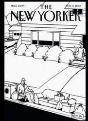
The work of Bruce Eric Kaplan, also known by the shorthand of BEK, graces both the inside and the outside of the May 3 issue of _The New Yorker_. That’s quite a coup for an artist “who”:http://www.mediabistro.com/articles/cache/a1455.asp used to live “in a space that was meant to hold just one car and maybe some old boxes or tools or whatever it is people put in (half of) a garage” and submitted cartoons to _The New Yorker_ for three years before one was accepted.
Kaplan’s cartoon (on page 60) is about people watching a thriller about bunny rabbits (“Don’t go into that hole!”). His cover, called “Spring Cleaning,” depicts the act of clearing out the clutter from a suburban house.
Part of the clutter on the curb consists of items like an old washer, sofa, and lamp, as well as another old relic: the cleaner’s husband. The husband’s attachment to his rocking chair, which has suffered the same fate, symbolizes the inertia and dotage that led to his being discarded in the first place.
The spring cleaner grins in triumph; she has rid herself of some dusty and useless items, perhaps to be replaced by newer models. The long winter is over.
In “Spring Cleaning,” Kaplan retains the distinctive style of his cartoons: the boxy, pupil-less figures with the starfish stance, the heavy blacks and lack of grays and washes, and the off-kilter and dark humor.
Kaplan wrote one of my favorite _Seinfeld_ episodes, “The Cartoon.” This episode satirized the “typical _New Yorker_ cartoon,” in which a frustrated and confused Elaine accuses the _New Yorker’s_ cartoon editor of simply running doodles of “a couple of bears at a cocktail party talking about the stock market.”
Kaplan’s cartoons are of course not about bears at a cocktail party talking about the stock market, but are set in a slightly skewed reality in which reality and our darkest thoughts intersect. Kaplan’s cover is set in a surreal suburban landscape, in which the old station wagon is parked in the driveway and the paterfamilias is parked on the curb.
The gag cover would work just as well as a 4 inch by 4 inch cartoon within the magazine’s pages, but its presence on the cover gives us a refreshing, black-and-white slice of BEK’s brain at the very beginning.
Sempé Fi: The Green Fields
_Pollux writes_:
The massive oil spill makes landfall today in the Gulf of Mexico, oozing towards the marshlands of Louisiana that threaten bird breeding areas, oyster beds, otter playgrounds, tuna spawning grounds, and President Obama’s plan for expanded offshore drilling.
The oil rig explosion and ensuing spillage remind us that despite our awareness that the earth is a fragile planet, we are still very careless with it, like an 8-year-old playing and then breaking his father’s expensive watch.
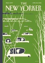
“Frank Viva’s”:http://www.francisaviva.com/ cover, “Earth Day,” for the April 26, 2010 issue of _The New Yorker_, reveals a planet that is busy and humming with activity. Oil is not spilling and exhaust fumes are not being discharged from Viva’s oddly-shaped cars.
Nonetheless, we are all aware of the damage that our inventions can cause. Despite the stylized shapes and smiling faces, Viva has created a cover filled with very timely significance and meaning.
His cover is dominated by power line towers. They crowd out and outnumber his trees. The power line towers extend confidently and aggressively across the landscape and skyline. In the distance, the horizon consists of a long cityscape. Cars whiz across the cover, moving almost as if in formation towards the east, where a few trees bereft of leaves can be found.
Viva’s cover is dominated by the color green, but it is a green that is reduced and lacerated by white shapes and lines that symbolize the intrusion of technology over nature.
Frantic efforts to contain the Gulf of Mexico spill to prevent an ecological and financial crisis cannot erase the initial carelessness that caused it. Like the figures on Viva’s _New Yorker_ cover, we put up towers and drive our cars but don’t stop to think about how much less green our world is, despite the coming and going of “Earth Day.”
Sempé Fi: Et in Arcadia I Go

_Pollux writes_:
Lust is in the air. The hooves of libidinous satyrs and the perfectly formed feet of nymphs pitter-patter across the lawns of Central Park.
In “Edward Sorel’s”:http://www.edwardsorel.com/ “Spring Has Sprung,” which graces the cover of the April 12, 2010 issue of _The New Yorker_, Sorel transplants the Dionysian satyrs and nymphs of Greek myth to Central Park.
The scene is pastoral but not motionless. Sorel’s linework creates the illusion of rapid movement and change, symbolizing the coming of spring. “Spring Has Sprung,” evoking the High Renaissance work of Titian or the Baroque paintings of Peter Paul Rubens, is playful and spirited. It is modernized, but not obviously so. Only the baby carriage, lamp post, and skyscrapers in the background betray our modern era.
Sorel’s beardless satyrs cavort and play like they’ve done since time immemorial. The satyrs engage in passionate and amorous activities, sometimes taking the lead, sometimes not. In Greek myths, satyrs usually did all of the chasing, but Sorel’s nymphs are sexually confident, kissing their male companions with verve and initiative. Spring has truly sprung.
But it is not all lust. A nymph gazes into the eyes of a reclining satyr, who plays a pipe. Another couple gazes at a pond from a bridge, while another goes for a walk through the woods. A single satyr sits on a tree, serenading the carnal carousing with a tune from a double shepherd’s pipe.
Sorel’s update on Arcadia introduces a wistful note as well. An older satyr smiles knowingly at the revels while pushing the product of love or lust in a baby carriage. He’s bearded, balding on top, and bespectacled, but a satyr never forgets.
Sempé Fi: Paw in the Family

_Pollux writes_:
Did you know that there are about a hundred and fifty different rabbit coat colors? The color of rabbit fur can range from orange to opal agouti, from chocolate tortoiseshell to frosted pearl.
Some of these colors appear in “Kathy Osborn’s”:http://www.kathyosborn.com/ cover for the April 5, 2010 of _The New Yorker_, which is awash with a gouache-based array of various members of an extended rabbit family.
The Easter Bunny always seemed to me a lonely figure, a leporid deity condemned to roam the earth with an incongruous basket of eggs and chocolate. Usually he wears a big bow as well.
But Osborn’s “The Bunny Family” gives us an extensive gallery of countless bunnies in various poses, wearing different expressions. Even bunny families have a hierarchy. In the center of the cover, Osborn gives us a proud black-and-white paterfamilias and the equally important matriarch of this bunny family. Ears twist and swirl; bunnies frown or sleep. Some portraits are group shots.
The web forum known as Pattern Pulp, founded by Shayna Kulik, which is “devoted to tracking ideas and emerging trends that expose, celebrate, share and connect pattern design across all creative platforms,” “sees”:http://www.patternpulp.com/art/follow-up-bunny-portraiture/ a bunny family portrait-themed trend emerging in various forms and formats:
At first glance, last week’s New Yorker cover by Kathy Osborn seems like a cute parody on rabbits, Easter and Grant Wood’s infamous 1930 farmer portrait. The idea of a family tree composed entirely of bunnies, captured in stylistic unison is humorous, charming and rather surreal. A year ago, Bergdorf Goodman’s window display revealed a wall of hand painted bunnies framed against a green backdrop. Fast forward and we now have framed imagery from Hunt Slonem’s Manhattan oasis showcasing his own homage to the bunny world. Joe Zee, Elle’s Creative Director, always says, two times a coincidence, 3 times a trend, so we ask, are other adorable cuddlies going to continue adorning walls around the world or will these visual stories alternate as whims change and moods shift?
But Osborn’s “covers”:http://www.cartoonbank.com/bin/venda?ex=co_wizr-locayta&template=wz_locayta&pageno=1&perpage=20&collate=ivtype%3Apdxtlayout%3Apdxtstyle%3Apdxtdecade%3Apdxtpublicationdate%3Apdxtartist%3Apdxtpublished%3Apdxtperson%3Apdxtdesigner%3Apdxtauthor%3Apdxtlocation%3Apdxtcity%3Apdxtstate%3Apdxtcountry%3Apdxtoriginalartavailable&refine_sort_alph=&fieldrtype=type&termtextrtype=invt&typertype=exact&fieldcatrestrict=xancestorid&termtextcatrestrict=shop&typecatrestrict=exact&typekeywordsearch=keyword&termtextkeywordsearch=Kathy+Osborn for _The New Yorker_ have given us a wide array of original, surreal, and eye-catching imagery.
Osborn’s “Bunny Family” not only can be considered part of a larger trend of rabbit-themed artwork but it also fits as snugly as a bunny in a burrow within Osborn’s colorful, humorous, and off-beat work.
Sempé Fi: Head Peace
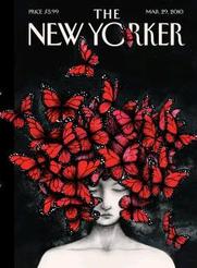
_Pollux writes_:
“Homage” is the title of Ana Juan’s cover for the March 29, 2010 issue of _The New Yorker_. This issue is The Style Issue and the cover pays homage to a designer who recently passed away, “Alexander McQueen.”:http://www.alexandermcqueen.com/
Juan’s cover pays homage to not only McQueen, but to one of his Spring 2008 headpieces as well, a picture of which can be seen “here.”:http://blogs.reuters.com/oddly-enough/files/2007/10/fashion-butterfly-300.jpg
Johanna Cox of _Elle_ “asked”:http://fashion.elle.com/blog/2010/03/artist-ana-juan-recreates-mcqueen-.html Ana Juan why the Spanish artist had selected McQueen’s headpiece. “I think it was the most poetic as a metaphor of death,” Juan responded. “The idea was to express a certain melancholic beauty without forgetting the Spring flair.”
Cox writes that Juan’s cover “is the most economical but also the most hauntingly beautiful” of the tributes made to McQueen. Juan also manages to incorporate a common symbol associated with _New Yorker_ covers, a butterfly, while also maintaining her own style.
Juan’s use of coal-based whites, grays, and blacks symbolize the passage into death of a designer whose life ended so suddenly and so tragically. The burst of acrylic-based color associated with the butterflies assures us, however, that his work and the work that he will inspire, lives on.
The butterflies themselves seem to pay tribute to McQueen, fluttering and collectively reminding us that beauty still exists amidst a world filled with tragedy, drabness, and death.
Sempé Fi: Empire State of Mind
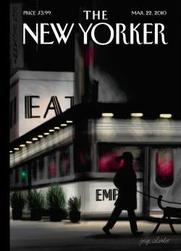
_Pollux writes_:
“The Empire Diner, the world’s finest and possibly hippest Diner, is famous not only for its outstanding atmosphere, but also for great food, top notch service, and being a homestyle, basic-food restaurant.” So proclaims the “website”:http://www.empire-diner.com/ of Empire Diner, which forms the backdrop of the March 22, 2010 cover of _The New Yorker_.
The cover artist, “Jorge Colombo”:http://www.newyorker.com/online/blogs/fingerpainting/2010/03/evening-walk.html, renders Chelsea’s Empire Diner into a glowing, nocturnal haven, the windows of which are illuminated with bursts of grays and dark pinks. The reflection of a traffic light is visible on one of the Diner’s windows, emphasizing the perpetual movement of cars on the road.
Instead of a straightforward and literal depiction of the Diner, of which there are plenty in countless television shows (such as _Law & Order_) and films (such as _Men in Black II_), Colombo here gives us a nighttime scene whose “main character” is not a customer of the Diner at all but a figure walking her dog.
The dog-walker is completely enshrouded in shadows and darkness, while the Diner twinkles and glows in the background. Colombo’s “Evening Walk,” created on his iPhone, focuses its attention on the contrast between the figure outside of the Diner and the Diner itself. Colombo himself is an outsider looking in. Instead of sitting down to a meal of a Negimaki Burger and Jack’s Chili Sundae, he is outside of the 24-hour Diner, looking, absorbing, and creating.
Like many of Colombo’s covers, “Evening Walk” is a study of color and light. Colombo’s eye is that of an artist rather than someone intent on simply creating something on his iPhone. The newness of using the iPhone for artistic purposes has worn off, but the power of Colombo’s interpretations of New York City has not.
Empire Diner, which has New York Landmark status, is immortalized by Colombo, but “Evening Walk” is not an advertisement for the Diner. Colombo partially obscures, perhaps intentionally, the words “Empire” and “Eat.” The emphasis here is on Colombo’s brushes with the life and magic of the city streets rather than his considerable skill with the Brushes application.