

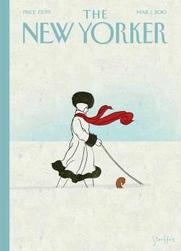
_Pollux writes_:
It is the night of the big concert. A spotlight illuminates a world-famous violinist. The stage is set; the venue is expensive and elaborate.
The violinist, however, has stepped aside. She gestures towards a little old lady at the piano. It is the pianist’s moment now. The elderly pianist modestly accepts the violinist’s gesture.
Some of the spotlight attaches itself to the pianist’s head like a halo. This is the charming scene that Jean-Jacques Sempé has created for the cover of the March 15, 2010 issue of _The New Yorker_, called “In the Spotlight.”
As always, Sempé’s human figures are miniscule but not insignificant. Sempé’s figures are the emotional and humorous focus of his art, and the inky details are used to create his cartoon figures.
Sempé’s backgrounds, meanwhile, are less sharply defined and created with watercolors.
It is the people who are important here, and for “In the Spotlight,” Sempé has created a charming and touching scene. The younger woman has put all ego and ambition aside to give the older woman an opportunity perhaps never given to her: the opportunity to perform before an audience.
The older woman, perhaps a piano teacher or an amateur piano player, has the chance now to share her musical gifts with the world. The violinist is all too happy to give her that chance.
In a world of selfishness and naked ambition, Sempé creates a scene that is not optimistic but not overly idealistic. May all who deserve a moment in the spotlight get that chance one day.
Category Archives: Sempé Fi
Sempé Fi: Winter Flapper
_Pollux writes_:
She’s knee-deep in a blanket of pure white snow. She’s out for a walk with her dog. Her faithful dog cannot be seen except for its tail. In fact, the dog is clearing a pathway for her as they make their way through the wintry landscape.
This is the scene depicted in “Brian Stauffer’s”:http://www.brianstauffer.com/bio.html cover for the March 1, 2010 issue of _The New Yorker_, called “Whiteout.”
A cold wind blows the woman’s scarf. She’s wrapped up tightly and stylishly in a fashion reminiscent of the 1920s. In fact, the entire cover evokes the 1920s covers for _Vogue_, which featured images of flappers and glamorous women in a minimal, Art Deco style. The focus of these _Vogue_ covers was on the clothes, on the style, and on the attitude of the Jazz Age. “This”:http://gsahcy2t2drawing.blogspot.com/2009/02/helen-dryden-american-vogue-cover-1922.html 1922 _Vogue_ cover, for example, by the artist Helen Dryden, shows another dog-walking scene, this time from the summer or spring.
With his use of clean inked lines, Stauffer has created a cover that appears both timeless and vintage. For all we know, we could be seeing a scene from the confident 1920s or a scene from these uncertain 2010s.
Stauffer’s young lady knows how to add a touch of glamour and color to the otherwise empty landscape. Her bright red scarf flaps in the wind as confidently as a naval flag. The charcoal-black fur trimmings give her a sense of elegance and sobriety.
Just because she’s out for a walk with her dog doesn’t mean she has to dress down.
Secret Tilley Revealed: A Hidden Image
_Pollux writes_:
Did you know that if you place the four Anniversary _New Yorker_ covers together, this creates a large composite image of Eustace Tilley? When I “wrote”:http://emdashes.com/2010/02/sempe-fi-7.php about the covers a few days ago, this had escaped my attention.
It wasn’t Dan Brown (or his hero Robert Langdon) who have told me. You can read about this hidden image at the blog “Kempa.com”:http://www.kempa.com/2010/02/09/new-yorker-85th-anniversary-covers-hidden-image/.
Adam Kempa, the blog’s creator, has cleverly, and helpfully, created an overlay of the four covers to reveal the subtle outlines of Tilley.
Sempé Fi: Boing Boing Discusses 1946 Alajalov Cover
_Pollux writes_:
Over at Boing Boing, they’re “discussing”:http://www.boingboing.net/2010/02/25/march-16-1946-cover.html the March 16, 1946 cover for _The New Yorker_, created by artist “Constantin Alajalov.”:http://www.illustration-house.com/bios/alajalov_bio.html
Sempé Fi: The Butterfly Effect (Four Covers for The Anniversary Issue)
_Pollux writes_:
The February 15 & 22 issue of _The New Yorker_ was The Anniversary Issue of the magazine. To celebrate this occasion, _The New Yorker_ ran a quadruple cover that honored its history, mascot, and sense of humor.
Four artists created various _New Yorker_-tinged realities: in 1925, a struggling male model visits a new publication in order to pose, to his horror, as Eustace Tilley; Eustace’s Butterfly, who also reacts negatively to a vision of Eustace Tilley, performs a poetic monologue; a world of Tilley-like figures record and observe butterflies; Rea Irvin creates the mascot of Eustace Tilley. These visions are both tributes and tongue-in-cheek interpretations of _New Yorker_ history.
Back in 1925, did a male model pose as Eustace Tilley “just the way Mr. Irvin stipulated” for the magazine’s release?
No, but in Adrian Tomine’s “Adaptation,” we are presented with an alternative version of history in which the secret origins of Tilley are revealed. Tomine blurs the line between fantasy and reality, incorporating the magazine’s price tag and date, for example, into the flow of the story. What is real and what is not? Tilley’s Butterfly floats above the male model in the third panel. Tilley’s Butterfly will appear on all four covers, either as an observer or as an observed figure.
In Daniel Clowes’ “Survival of the Fittest,” Tilley’s Butterfly is the cover’s protagonist and main character. A poetic monologue emanates from the butterfly, who reflects on the vanity and destructiveness of mankind.
Tilley’s Butterfly is a scholar, and a hungry scholar at that. He hunts for “elusive nectar,” and finds horror instead, in the form of Eustace Tilley posing in an artist’s studio. Both Tomine and Clowes treat Tilley as a sort of grotesque figure, and in many ways, he is, with his stiff, long neck; large, intimidating suit; top hat; and white gloves.
In Ivan Brunetti’s “Biodiversity,” Tilley is multiplied and transformed into various small figures. Brunetti’s figures retain the size and shape of most of his figures save for the triangular, conceited nose that characterizes Tilley. Brunetti’s hybridized figures, like Tilley, observe butterflies, but do so by different means. They paint the butterfly, create drawings of it on an Etch A Sketch, photograph it, analyze it, and research it. Who needs a monocle when you have an iPhone?
On Ware’s cover, we find the creator of both Tilley and the butterfly: Rea Irvin. In this “piece”:http://www.newyorker.com/online/blogs/tny/2010/02/chris-ware-rea-irvin.html#ixzz0gUsG2sE4 by Chris Ware on the _New Yorker_ site, Ware discusses the difficulties of finding an image of Rea Irvin that he could use as a reference point for his anniversary cover.
As “Emily Gordon”:http://www.printmag.com/Article.aspx?ArticleSlug=Everybody_Loves_Rea_Irvin and I have learned ourselves, Rea Irvin is not an easy historical figure to track down. As Ware writes, “…in this age of find-everything-now, Rea Irvin is nowhere to be found. Do a Google image search and you just get twenty-eight thousand Eustace Tilleys.”
Ware came across the same first image of Irvin that I came across: Irvin sitting cross-legged on a beach in a Buddha-like pose (it is not clear why). In his cover “Natural Selection,” Chris Ware uses this photo as a starting point for his tribute to Irvin. “It occurred to me only afterward,” Ware writes in the same post, “that my efforts at portraiture were essentially ridiculous, since no one today, not even the magazine’s current staff, would know what Irvin looked like.”
Nevertheless, Ware’s cover does what Emdashes has been trying to do: insert Irvin into the popular consciousness so that he does become a recognizable, and recognized, figure in American history.
Rea Irvin is the dominant figure on this cover. Though Tilley’s Butterfly hovers nearest to us, we are drawn to the portly, serious-minded art director who is considering various animal companions for Tilley. Ware’s Irvin believes in research and accuracy: Irvin has a top hat and coat, and has reference books open. Irvin looks keenly at the sketched Tilley figure; something is missing.
Will Tilley’s monocle be focused on a bird, scorpion, primate, bee, wasp, or grasshopper? Which animal will work best?
Irvin has yet to consider the butterfly as the possibility, but we are arriving at the moment of imminent inspiration. Tilley’s Butterfly floats above Irvin in the same way that a flash of inspiration floats above all of us, ready to settle in our brain as soon as we are ready and conditions are right.
Happy Anniversary, _New Yorker_! May there be many more.
Sempé Fi: The Houndstooth

_Pollux writes_:
Are dog-sweaters and dog-coats just silly accessories? After all, dogs have fur, so why would they need to wrap up for the winters as humans do? But dogs, despite their natural furry coats, get cold, they get wet, and they get uncomfortable.
As one blog “points out”:http://askville.amazon.com/put-sweater-dog-cold-weather/AnswerViewer.do?requestId=5154211, “small dogs, such as Chihuahuas and Maltese; also Yorkies, Lhasa Apsos, and Shih tzus (especially if clipped) need protection from the cold, along with Bichon Frise and short-haired dachshunds to name a few… if your dog seems to be cold, then yes, he or she should wear a sweater.”
People want and need these coats for their little dogs. Dogs shiver without the extra protection. “Recently”:http://blogs.orlandosentinel.com/features_lifestyle_animal/2010/02/how-cold-thief-takes-coat-off-dogs-back.html, a terrier named Lexie was the victim of a mugging in Brooklyn. While Lexie’s owner went into a store to buy milk, a thief ripped the $25 woolen dog coat right off Lexie’s back. Presumably the stolen coat will clothe another dog that needs it.
It is a collection of small dogs that we find on the cover for the February 8, 2010 issue of _The New Yorker_, illustrated by Spanish artist “Ana Juan.”:http://www.anajuan.net/
“Baby, It’s Cold Outside” is the name of Juan’s cover, which delights in depicting various breeds wearing various brands of winter-wear: a bulldog wears a deer hunter, a poodle wears earmuffs, a Chihuahua wears a poofy Gore-Tex coat, a Griffon wears an overcoat.
This cover concept gives Juan the opportunity to experiment with a wide variety of textures and colors. We can almost feel the dogs’ sweaters, hats, and coats, as well as the fur of the dogs themselves.
These dogs are all well taken care of, and they seem snug and warm. But the dogs also seem a little embarrassed and confused by the extra padding created by the canine clothing. Immobilized by their leashes and by the cold, they stand about in the dog park while their owners presumably chit-chit about the cold weather.
Ana Juan is a longtime “contributor”:http://www.cartoonbank.com/bin/venda?ex=co_wizr-locayta&template=wz_locayta&pageno=1&perpage=20&collate=ivtype%3Apdxtlayout%3Apdxtstyle%3Apdxtdecade%3Apdxtpublicationdate%3Apdxtartist%3Apdxtpublished%3Apdxtperson%3Apdxtdesigner%3Apdxtauthor%3Apdxtlocation%3Apdxtcity%3Apdxtstate%3Apdxtcountry%3Apdxtoriginalartavailable&refine_sort_alph=&fieldrtype=type&termtextrtype=invt&typertype=exact&fieldcatrestrict=xancestorid&termtextcatrestrict=shop&typecatrestrict=exact&typekeywordsearch=keyword&termtextkeywordsearch=Ana+Juan of covers to _The New Yorker_, giving us so far almost twenty covers depicting everything from Napoleon concealing a soccer ball in his coat to a February 2, 2004 cover depicting a woman wearing a fur coat being pursued by cats attracted to the texture of her apparel. As with “Baby, It’s Cold Outside,” Ana Juan skillfully creates an illusion of depth and texture to her figures. You want to stroke the fur on the female figure’s coat.
This tactile quality to her work lends itself well to the world of children’s illustration, and Ana Juan’s 2004 book “The Night Eater”:http://www.amazon.com/Night-Eater-Keats-Illustrator-Award/dp/0439488915, which she wrote and illustrated, is replete with clouds and landscapes that look “touchable.”
Juan’s wrapped-up dogs make us smile and give us comfort in the winter cold. As the Urban Newlyweds blog “writes”:http://urbannewlyweds.com/, “The February 8, 2010 issue of The New Yorker was just too cute to pass up, and timely! Be sure to bundle up with your loved ones (your hub and your pup) and enjoy the snow-covered city scenery this weekend.”
Baby, it’s cold outside. To misquote the song of the same name, “Say, lend me your coat – It’s up to your knees out there.”
Sempé Fi: The Life of the World to Come
_Pollux writes_:
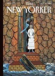
The cover for the January 25, 2010 issue of _The New Yorker_ was created by a Haitian artist, “Frantz Zephirin.”:http://www.haitian-art-co.com/artists/fzephrin.html Zephirin, according to the Contributors page, “lives on a mountain overlooking the village of Mariani, not far from the epicenter of the earthquake that struck the country on January 12th.”
From his mountaintop, Zephirin has a clearer, closer view of the tragedy that manifests itself in an abstract vision of the afterlife. On _The New Yorker_ website, Blake Eskin has written a “Cover Story”:http://www.newyorker.com/online/blogs/newsdesk/2010/01/cover-story-frantz-zephirin.html on Zephirin’s piece. As Eskin points out, Zephirin’s cover was painted in 2007. Nevertheless, its symbolism and its associations with life and death are particularly appropriate for this 2010 cover, in view of the enormous losses and tragedy associated with the recent earthquake.
On _60 Minutes_, we see construction equipment scooping up the dead from the tragic earthquake, and piles of nameless bodies lying in a flattened cityscape. We hear numbers and more numbers: the number of casualties, the earthquake’s magnitude, the amount of monetary aid pouring in, the numbers to call, the number of troops sent by various governments, the number to which we can send text messages in aid of the disaster. We hope it is not so bad as the initial reports say, and realize that it is, in fact, worse.
Zephirin’s cover, called “The Resurrection of the Dead,” is an affirmation of the individuality of those who have perished in the disaster. Instead of numbers or piles of bodies, we see faces, many faces, with eyes and mouth open. According to “one website”:http://www.haitian-art-co.com/artists/fzephrin.html, Zephirin’s work is “characterized by its bright colors, patterns, tightly compacted compositions; and by the human figures with animal heads, which represent his cynicism for the ruling body.”
Instead of mangled bodies, we see beautiful faces, and each face is slightly different from the next. The expressions that we see are neither particularly happy nor sad, nor particularly masculine nor feminine. As androgynous as an angel, each face looks out from variously-shaped, interlocking tiles that hold up the vast vault of the afterlife. As Elizabeth McAlister points out in Eskin’s Cover Story, “the unblinking faces of the spirits of the recently dead. Just crossed over, they still have eyes, which are the blue and red of the Haitian flag.”
Through the open door, we see darkness and cobwebs. At first, I believed this to be a vision of hell, inhabited by grinning skeletal figures, one of whom wears a military uniform, representing military misrule and intervention, both internal and external. The other figures are dressed in clothing of the upper bourgeois. The female skeleton is similar to the figures one sees in a Frida Kahlo painting.
But it not so much hell as a border crossing between life and death. As Eskin’s piece points, gallery-owner Bill Bollendorf identifies the three skeletal figures in the doorway as representing the Guédé, “members of a family of spirits who guard the frontier between life and death. The woman in the wedding dress is Gran’ Brigitte, and the man in the blue uniform is her husband, Baron Samedi.”
Zephirin’s skeletal inhabitants open the wooden door that marks the boundary line. They grin triumphantly. The destructive power of the natural world, worsened by decades of misrule and corruption, has triumphed for the moment.
Debris, in the form of a wooden board, washes against the steps that lead to the this border crossing. The fast currents of this version of the River Styx will no doubt wash the debris away. Time moves the currents. And soon the door will close.
But the faces will remain forever, looking at us, asking us not to forget them.
Sempé Fi: The Long and Winding Road

_Pollux writes_:
A young man glides eagerly through the dark streets of the city. He’s hunched forward for maximum speed. He speeds past an apartment building with largely darkened windows save one, and a closed store named “Minx.” Where will this road lead him?
“Frank Viva’s”:http://www.francisaviva.com cover for the January 18, 2010 issue of _The New Yorker_ strikes me as being a cross between a Valentine’s Day cover and a Christmas cover.
This may or may not have been the illustrator’s intent, but mid-January is when we begin to see Valentine’s Day gifts and paraphernalia in the stores, as well as Christmas trees lying sadly in alleyways and dumpsters. We are like the Roman god Janus, with two heads looking in opposite directions at the past and the future.
Viva’s cover, called “Great Expectations,” depicts a young man on a bicycle bearing gifts in a shoulder bag. There is a tube and a box wrapped in shiny, red wrapping paper. His canine companion, bearing a tag and a bouquet of flowers in its mouth, sits in the bicycle’s basket. The cyclist, depicted in an elongated, paper-cutout style, sits on a delightfully whimsical, mechanically impossible bicycle.
I was curious about how the image was created, so I contacted Mr. Viva directly. The final artwork for “Great Expectations” is digital, but the work began as a pencil sketch. On his blog, Oliver Yaphe “writes”:http://oliveryaphe.com/tag/frank-viva that Viva’s style is “modern and distinct and gaining serious momentum.”
We can see some of Viva’s sketches “here”:http://www.vivaandco.com/TheWork/Illustration/Sketchbooks.aspx, where you’ll find some similarly styled bicycles.
We may be like the two-headed Janus, but Viva’s cyclist looks only forward: perhaps the cyclist is on his way to declare his love to a current or hoped-for girlfriend; the dog itself may be a gift. The young man expects great, crowning success. The night is gloomy, but the young man’s great expectations illuminate his face and create a cheerful scene.
This is Viva’s first cover for _The New Yorker_. According to his website, “when _The New Yorker_ called, Frank jumped up and bumped his head (rather badly) on the desk lamp. It didn’t hurt a bit.”
Viva is an illustrator, writer, graphic designer, and children’s book author. “Great Expectations” is, according to his website, inspired by his forthcoming children’s picture book, “Along a Long Road”:http://www.vivaandco.com/TheWork/Illustration/HarperCollins.aspx, which features a young boy on a cycling adventure through his city.
Viva’s cyclist for this _New Yorker_ cover seeks not only adventure but also romance. The road takes him to someone’s door. Hope propels him forward. We cheer him on.
Sempé Fi: Poles Apart

_Pollux writes_:
Deep layers of snow cover a lot of America and Europe at the moment. While commuters may not be having a good time, skiers have the opportunity to revel in resorts reporting record attendance levels.
Skiers are on top of the world, both literally and figuratively, and “Top of the World” is the name of “Jan Van Der Veken’s”:http://www.fabricagrafica.be/content/page.asp cover for the January 11, 2010 issue of _The New Yorker_.
This is the Belgian illustrator’s second cover for _The New Yorker_, and it depicts, like his first cover, a smiling, winter-bound young couple. However, while Van Der Veken’s December 7 “cover”:http://emdashes.com/2009/12/sempe-fi-o-christmas-tree.php was the very picture of closeness, depicting two Christmas shoppers literally wrapped together, the skiing couple on his January cover share the ski-slope and little else.
The young man takes a picture of the snowy landscape. The young woman chit-chats with someone on her cell phone. They are having a pleasant time, but are not really sharing the experience together.
On her blog, designer Poppy Gall has written a “post”:http://poppygall.com/blog/tag/jan-van-der-veken/ on this cover:
The way artist Jan Van Der Veken juxtaposes a stylized retro ski poster look and digital gizmos makes me smile. This is a familiar scene at any ski area. Skiers with iPhones know they’re worthless while wearing gloves. But those slim cameras do fit nicely in your pocket.
Van Der Veken’s juxtaposition of retro and ultra-modern is seamless. He fuses past and present into an image that comments on our own era while reaching back to artistic styles and designs of the 1950s. Van Der Veken’s young skiers are thoroughly modern, and there’s no better way to depict a couple of 2010 than to include the technological gadgets that we can’t seem to do without.
It would be pointless to lament about how disconnected people are when they are together and connected, not to each other, but to their iPhones, Panasonic Lumixes, and Blackberries.
But that is how we function nowadays, whether we like it or not. While iPhones may be useless while wearing gloves, they may come in handy when it comes to finding directions to the ski lodge or, God forbid, in an emergency situation. A true vacation for some would be to go offline for days on end; for others, the prospect of that would be nightmarish.
Van Der Veken’s mountaintop scene, however, is not a nightmarish vision, but one of splendid semi-isolation.
Sempé Fi: Old News

_Pollux writes_:
It’s not just out with the old and in with the new. The old are condemned to hard labor for all eternity, like Sisyphus rolling his boulder up a hill.
“Ivan Brunetti’s”:http://en.wikipedia.org/wiki/Ivan_Brunetti trademark egg-headed, stick-legged little people appear as lab technicians on the January 4, 2010 cover of _The New Yorker_. The cover, called “Ring Out the Old, Ring In the New,” gives us a twist on the old iconography associated with New Year’s.
In Brunetti’s vision, Baby New Year is being manufactured and readied by hard-working scientists, mathematicians, data analysts, and technicians.
Father Time, meanwhile, who is associated with the older, passing year, is unhappily mopping the floor of the manufacturing plant. 2009 was a year that will forever be associated with economic woes; perhaps Brunetti’s Father Time has found that he cannot retire comfortably. He must keep on working. Despite his experience, he is at the bottom of the ladder at the factory.
Will the same fate await Baby New Year 2010? The year 2009 was once full of hope and energy too, until economic and political challenges added wrinkles and gray hair to its once youthful frame.
Brunetti’s technicians, perhaps fueled by hopes of green jobs and economic recovery, work hard to ensure that 2010 will be a good year.
However, despite their best, most scientific efforts, other forces will be at work in the coming year as well: chance, chaos, divine intervention, randomness, serendipity, and fate. It’s a new year: may it be a happy one.