

_Pollux writes_:
The cover for the October 12, 2009 issue of _The New Yorker_ is unique in that it is not one cover, but three, drawn by three different artists. The artists’ styles vary, but there is a narrative sequence in the thrice-covered magazine. The piece is called “The Food Chain.”
The cover is also unique in the sense that its composition was discussed on a new feature of _The New Yorker_ website, called “Behind the Cover.”:http://www.newyorker.com/online/blogs/tny/2009/10/money-issue-covers-video.html
I saw some of this feature on “Taxi TV” on the way to _New Yorker_ festival events. _Behind the Cover_, which features Françoise Mouly and the three artists, offers a great insight on the creation of the triple cover.
“Daniel Clowes”:http://en.wikipedia.org/wiki/Daniel_Clowes introduces us to the main character of “The Food Chain”: a rich Park Avenue matron. She finds herself in a grubby fast food joint. Clowes’ literal way of depicting human faces lends itself well here: she looks worried and confused.
She’s up next, and she’s not sure about what to order. The man that Clowes depicts behind her, on the other hand, looks comfortable in this environment. His worries are of a different kind, but his face betrays little emotion.
Have economic circumstances forced her to eat something other than foie gras crumbles, specially farmed Almas beluga caviar, and Rothschild estate wine? She clutches her purse. Her gleaming earrings and pearl necklace look out of place in an eatery that reeks of fatty French fries, melting snowcones, and contaminated hamburger meat.
We turn to the next cover. Drawn by the versatile “Zohar Lazar”:http://www.zoharlazar.com/, the cover is reminiscent of cartoons drawn by Peter Arno. The illustration is black and white save for the garish pink and yellow splashed across the fast food restaurant’s sign and array of products.
In Lazar’s scene, awash in Arnovian ink, a limo awaits the matron. She proudly carries her purchase. A maid carries the fries. A driver stiffly and elegantly holds the limo door open.
The October 12 issue in fact contains cartoons pulled “from the Archives,” from the time of the Great Depression. These include cartoons drawn by Gardner Rea, Leonard Dove, Alain (the pen name of Daniel Brustlein), and Helen Hokinson.
“Mark Ulriksen’s”:http://www.markulriksen.com/ cover, the last in the sequence, reveals the punchline: the burger wasn’t for the matron at all but for her poodle. Her worried expression was not caused by her thoughts on what food she would like for herself, but what would her poodle eat?
She made the right choice; the poodle’s tail wags happily and its tongue hangs expectantly. The narrative trick is revealed.
Ulriksen’s angular style and strange perspectives shift the focus from matron to canine. The third cover is focused on the dog’s happy face. The woman’s face is literally out of the picture.
We see a little of her home: solid oak tables upon which rich vases, expensive bound books, and fresh flowers rest. An immaculate carpet, the domain of the poodle and now littered with a few fries that have fallen carelessly on the floor (the maid will be fired for that).
What does “The Food Chain” say about our times? That fast food is only fit for dogs? Or that, despite the recession, the rich are not being forced to buy fast food for themselves in order to survive. It hasn’t come to that yet, if it ever will, and the woman’s jewelry, drawn by all three artists, glints proudly and arrogantly. It won’t end up in a pawn shop.
The point of “The Food Chain” is that the recession of 2008 and 2009 has yet to reach the society-altering magnitude of The Great Depression.
Most of the rich have remained rich. If they have to cut back, it’s not for themselves. The woman is scaling back a little, but not for herself. She’s cutting costs, perhaps temporarily, for Fifi the Poodle. She’s braved the drive down to the fast food joint. It’s been a hectic day.
The October 12 issue is “The Money Issue,” and some people have more money than others, and always will.
Category Archives: Sempé Fi
Sempé Fi: On the Catwalk
_Pollux writes_:
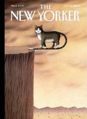
Not too long ago, when I opened my little mail-box, which lately has been crammed with catalogues from Halloween costume clearance houses, I was greeted by a little Sphinx-like cat on the cover of _The New Yorker_. Her death-defying stunt provided a dash of daring in an otherwise humdrum pile of mail. The cat was not just on the edge but over it.
The October 5, 2009 cover for _The New Yorker_ is called “On the Edge.” It was created by Turkish artist “Gürbüz DoÄŸan EkÅŸioÄŸlu”:http://www.gurbuz-de.com/, who signs as _Gürbüz_ or _Gurbuz_.
This is Gürbüz’s sixth cover for the magazine. Three of his previous _New Yorker_ covers have featured mysterious cats. His January 6, 1992 “cover”:http://www.cartoonbank.com/1992/New-Yorker-Cover-161992/invt/124845 featured a cat in a coffee cup.
Gürbüz’s March 22, 1993 “cover”:http://www.cartoonbank.com/1993/New-Yorker-Cover-3221993/invt/124869 featured a black-and-white cat whose tail metamorphoses into an enormous black-and-white ball of yarn, while his January 3, 2005 “cover”:http://www.cartoonbank.com/2005/New-Yorker-Cover-132005/invt/128388 featured a cat whose tail becomes a maze surrounded by mice. None of the mice, wisely enough, dares to enter.
Gürbüz’s new cover with a cat is just as enigmatic as his previous ones, and his new cat bears the same inscrutable expression. Like his previous cats, Gürbüz’s new creature finds herself in a surreal dilemma that may or may not be self-imposed. The eyes of his striped cat are unblinking, and lie beneath a strangely parted hairstyle that evokes that of a woman.
Despite the strange situations in which these “ineffable effable” cats -to quote one of T.S. Eliot’s verses on Practical Cats– find themselves, Gürbüz’s kittens maintain their feline dignity. They look at us, as cats do. What are they thinking?
Gürbüz’s cat challenges the viewer, almost taunting him or her. Gürbüz’s cats perhaps have names that, like Eliot’s cats, “no human research can discover– / But THE CAT HIMSELF KNOWS, and will never confess.”
Did Gürbüz’s 2005 cat purposely make his tail into a labyrinth? Did this cat suddenly decide to walk out from a precipice on his own tail?
At the bottom of the cliffside is a very harsh, desert landscape. It’ll be a hard, painful fall if the cat falls, but this doesn’t seem to disturb her.
This Turkish artist celebrates and embraces the irrational, the surreal, and a video compendium of Gürbüz’s surrealistic work can be seen “here”:http://www.youtube.com/watch?v=Snt6k-i13Cs.
His work is haunting. Suspending things in thin air is taking a page from the playbook of Magritte, who suspended tubas, tables, and people in cloud-covered skyscapes in his paintings, to disturbing effect.
Is Gürbüz’s cat defying gravity, sanity, and normal feline behavior just because she can? Or is it for our sake? Perhaps there is a purpose in showing us that sometimes we need to defy the logical, and embrace the irrationality of life in order to survive it.
Should we, then, walk out on our own tails, so to speak, and answer the riddles in our own lives?
Either blind faith or extreme confidence allows the cat not to fall.
Sometimes, the cover “On the Edge” seems to say, we need to make a leap in order to surprise the world, defying convention and embracing action.
Sempé Fi (On Covers): Cars

_Pollux writes_:
A flying car soars across a street jam-packed with conveyances of every description. The flying car, an “Aerocar NX 59711”:http://www.sff.n.se/udda.htm, heads towards the entrance of a large parking structure, safely flying over a powerful burst of steam that explodes from a carriage.
This is part of an attention-grabbing automotive scene that car enthusiast and regular cover artist “Bruce McCall”:http://www.brucemccall.com has created for the September 28, 2009 cover for _The New Yorker_, called “Museum Parking”.
The cover is a car-lover’s delight. Flying cars, also known as roadable aircraft, are a reality, and there are cars from every decade and vehicles from past centuries. McCall’s proto-cars include horse-driven vehicles such as the chariot, covered wagon, and carriage.
As always, McCall delights in detail. As the _Scraps of Literacy_ blog “notes”:http://scrapsofliteracy.blogspot.com/2009/09/my-method-for-reading-new-yorker.html, “For Bruce McCall’s meticulous artwork, I look closer. I see the registration numbers on the tail of a flying car, the darkness inside the covered wagon, the stagecoach just entering the parking facility.”
Taking up a lot of space on the road is the Bordino Steam Carriage, introduced in 1854. Consisting of a carriage body attached to a boiler whose steam drove the Bordino’s twin cylinder engine, it required two drivers: one to stoke the boiler, the other to steer the vehicle by means of a tiller.
A light-colored Autobianchi Bianchina, to the right of a black Volkswagen, inches its way cautiously towards the Museum Parking entrance, while a Model T allows its faster and more powerful descendants to go through.
The street is crowded with vehicles, but not crowded with the tension that usually emanates from traffic situations. A red race car of the 1930s waits patiently behind a Roman charioteer. No one is speeding or yelling. No brakes screech; no insults are hurled.
Bruce McCall’s “Museum Parking” is a scene of calm. We drink in the length and breadth of human accomplishment in the field of automotive technology. We wonder about cars of the future and what they will look like. Will the Toyota Prius one day drive into a museum parking lot, to be replaced by something much better?
We realize that perhaps the best innovations have yet to come, if only the carmakers would stop scoffing at Silicon Valley “entrepreneurs.”:http://www.newyorker.com/reporting/2009/08/24/090824fa_fact_friend
Something striking about McCall’s cover, besides the finely detailed automobiles, is the perspective. We are flying at same altitude as the Aerocar, giving us a God-like perspective on the history of automobiles.
I like the omniscient feeling that McCall’s choice of perspective gives me, but this point of observation sometimes disconcerted the first editor and founder of _The New Yorker_.
As James Thurber writes in his book _The Years With Ross_, during Tuesday afternoon art conferences at The New Yorker, Harold Ross would often stare at a cover and ask: “Where am _I_ supposed to be? In a building across the street from that house, or up in an airplane or where?”
Where have these vehicles been? Are they returning to the museum once and for all, never to return to the road again? The museum parking structure is massive, practically eclipsing the museum itself, which lies in the distance from across the street.
Are we seeing how far we’ve come and how far we need to go in terms of car development? Did the vehicles leave the museum of their own volition? Do 1854 Bordino carriages dream of steam-powered sheep?
Sempé Fi (On Covers): Rosy-Fingered Dawn

_Pollux writes_:
When the rosy-fingered, golden-armed, saffron-robed Goddess of the Dawn, the child of Morning, appears, she illuminates the earth, bringing a sense of freshness and newness to whatever is to come.
“Jorge Colombo”:http://www.jorgecolombo.com conjures up this goddess for his September 21, 2009 cover for _The New Yorker_, called “Finger Painting: New Day.”
He does so on an iPhone, and uses only a finger to create a city skyline still mostly enshrouded in the shadow of night. The city awakens.
You can see how Colombo creates his piece in a 29-second “video”:http://www.newyorker.com/online/blogs/tny/2009/09/finger-painting-new-day.html at _The New Yorker_ website. Unfortunately, the video does not include a spoken commentary, and it would have been interesting to hear the story behind the cover or Colombo’s thought-process as he created this latest piece.
Colombo starts with the sky and all of its complex tones. Because the art tool he is using is a phone, Colombo can work undercover discovering the hidden beauties of the city.
But the cover’s value lies not so much in the fact that it was done on an iPhone or on how well Colombo depicts a city skyline on this appliance.
The cover’s worth lies with how well he creates an interesting cover with that indefinable quality that all good art pieces possess, whether they’re done in celadon-glazed clay or on a computer screen. That quality can best be described as soul-stirring or thought-provoking, or at the very least, artistically attractive.
There is grace in the cover. Instead of being created with fingers the size of umbrella handles that violently jab at a little screen, there exist instead soft and subtle tones summoned by an improvised but effective brush.
The city becomes beautiful in the soft light of dawn, a city sometimes made ugly with a rash of scrawled graffiti. It is a city pockmarked here and there with little imperfections and defects.
It is a city from which emerge the uneven teeth of water towers, ventilators, and rickety wooden stairs. Colombo beautifies them all as creates the subtle tones of dawn. There is a plane on its way to some international destination, and an office building slowly lighting up from the inside. We imagine inhabitants of this metropolis slowly rubbing the sleep from their eyes and hoping that the new day will be a good one.
For me, such images are what make Colombo’s cover a good cover, and it would be so even if it were created on canvas or paper.
Colombo is a serious artist and his iPhone art has crossed the line that separates the gimmicky and the innovative.
I appreciate the fact that _The New Yorker_ website features his work and how he creates it. I would appreciate even more if we could see on The New Yorker website how all the cover artists create their pieces, whether it’s Blitt and his pen, McCall and his brushes, or Staake and his digital creations.
In the meantime, we enjoy what we have, as we look forward to each new day.
Sempé Fi (On Covers): The Forest for the Knees

_Pollux writes_:
A puny, 1950s-style automobile navigates through a towering forest of stiletto heels and leather vamps. Ahead of the car there is a tunnel formed by the arch between heel and sole.
This strange passageway evokes the famous tunneled sequoia tree of Yosemite National Park, the Wawona Tree, through which cars could drive through until 1969, when it fell over.
The cover’s artist, “Bruce McCall”:http://www.brucemccall.com/bio/, doesn’t show us the forest canopy. Does it end at the shaft of the boots or extend all the way up the body of a beautiful but enormously tall woman?
My head reels with Freudian interpretations of McCall’s strange cover. A man putters down a road in a shrunken symbol of masculinity: an American car. He drives through woodland where women, or at least the symbols of women, tower above him, completely dominating him and the landscape.
The Mittyesque driver maneuvers slowly through the strange terrain. There are no confident clouds of dust emanating from the car. Caution! Knee High Boots ahead. Thurber’s intimidating women have put aside frumpy flower dresses and pulled on their Lumiani Novas or Michael Antonio Mckenzie Boots.
But my thoughts can travel down less psychosexual paths: I have ecological explanations for McCall’s cover as well. Is McCall pointing out that the leather boots, made from the skin of slaughtered carcasses, have replaced beautiful growing trees?
Where did the trees go? Have the Brobdingnagian boots simply kicked the pines aside or sprung fully manufactured from the ground? Has the earth been watered with buckles and sole stitchings? The cover conjures up surrealist spirits such as Magritte and De Chirico.
Perhaps, but this September 14, 2009 issue of _The New Yorker_ was “The Style Issue,” and McCall’s cover is aptly called “Step Into Style.” Shoe expert Desiree Stimpert “writes”:http://shoes.about.com/od/boots/a/knee_high_boots.htm about the “flattering ways of knee high boots”: “One of the best things about cooler weather is the appearance of knee high boots. With a multitude of attributes, knee high boots can make chunky calves appear slimmer and cover lower leg flaws; keep your legs warm; and look incredibly chic. In short, they’re extremely flattering, very practical, and incredibly stylish.”
This issue of _The New Yorker_ included profiles on Burberry, by Lauren Collins, and the internet shoe company Zappos.com, by Alexandra Jacobs. In Jacobs’ profile for the Annals of Retail, she writes that “owning a large collection of shoes in various styles and colors has, in the past decade, gone from being considered a sign of ultimate imperial excess (Imelda Marcos) to a constitutional right of the average American woman…”
McCall uses fall colors to adorn his boots. His boots are burnt orange, gold, twilight blue, aurora red, shady glade green. These are not colors I am privileged to see in Los Angeles, where Autumn is only the name of the Starbucks barista shoving over tepid cups of shady glade green tea over the counter.
Knee high boots, and the sexual power with which they are associated, are now for the average American woman, and no longer belong exclusively in the closets of a Pretty Woman, or La Femme Nikita, or your local dominatrix.
Ordinary women can actually collect shoes of all shapes and sizes. Consider Carrie Bradshaw or the Heineken “commercial”:http://www.youtube.com/watch?v=B1l_R7mE7Zk in which an ordinary woman shows off her group of friends an impressive walk-in closet lined with shoes. Her husband meanwhile reveals his walk-in fridge lined with bottles of Heineken while his friends shriek with delight.
McCall, whose work has appeared frequently this year, combines elegance with sheer mystery. I have the feeling that he can’t resist including a car somehow -he loves painting cars.
Whether the cover can be explained in Freudian, surrealist, or ecological theories, the boots are strongly and firmly planted in the ground. They move aside for no man, no car, and no tree.
Sempé Fi (On Covers): FWIW

_Pollux writes_:
It’s September and school is back in session. Welcome to Professor Pipsqueak’s Computer Literacy 101 class. The instructor is about ten to eleven years old; he has to stand on a stack of books just to be seen. None of the students, who are many decades older than their teacher, dare to ask Professor Pipsqueak just exactly how old he is for fear that he will give them low marks. The instructor is ruthless like that.
The pace of technology is also ruthless, leaving behind in the digital dust generations who were just getting used to the concept of e-mail. Now they have to learn a whole new language, an electronic Esperanto that serves as a pseudo-linguistic bridge between the older and younger generations. Everything is acronyms and shortcuts these days, ranging from NSFW (“Not Safe for Work”) to FWIW (“For What It’s Worth”).
“Ivan Brunetti’s”:http://en.wikipedia.org/wiki/Ivan_Brunetti September 7, 2009 cover for _The New Yorker_, called “Required Texts,” captures the confusion and puzzlement that greets some of the older generations when confronted by Internet Slang or tools like YouTube or iPods. It satirizes the need for someone who is not a part of Generation Y to catch up to their sons and grandsons.
As Brunetti did with his March 1, 2009 “cover”:http://emdashes.com/2009/03/sempe-fi-the-office.php, called “Ecosystem,” each of his egg-headed little figures offers us an individual anecdote. As with any class, there are those who are learning more quickly than others.
In the bottom row, a roguish elder gentleman passes a note to a prospective sweetheart. His screen reads “IMHO <3" ("In My Honest Opinion... Love), while hers reads "NSFW BFF" ("Not Safe for Work--Best Friends Forever). One of his neighbors is less proficient; his screen is a swirl of angry lines. A woman plays a game of Solitaire, perhaps for the first time; another uses an iPod.
In the second row from the top, a determined, white-haired lady seems well-equipped for the Digital Age: she uses anti-carpal tunnel syndrome wrist supports, an ergonomic foot rest, and a glare-guard.
Another elderly woman, wearing a sweater depicting a cat (she knitted it herself), logs onto YouTube, perhaps to watch the video of President Obama reacting to the yelps of ill-bred Congressman Wilson. There is another gentleman using the Internet to his advantage: by visiting a Viagra site and buying its products.
Some of the students just don't get it: one student uses a typewriter, another a quill and parchment. One student has simply given up and fallen asleep.
Perhaps some of the students are in class for a good reason: to keep an eye on, and to understand, what their children are up to. As one site "warns":http://www.noslang.com/parents.php, "There's a new trend popular among teenage chatters, and your filters won't pick up any of it. It's called l33tspeak, netspeak or just plain internet slang (leet speak from the word elite). You know what I'm talking about. Acronyms like lol wtf bbiab and nm... If you're concerned about your kids, it's absolutely crucial you learn to understand their language."
Adam Gopnik, in his book _Through the Children's Gate_, captures the confusion caused by the communication barriers that existed between him and his son. As he records, Gopnik believed for a time that "LOL" stood for "Lots of Love." "I could tell," Gopnik writes, "because it occurred at the end of so many of his instant messages. So I sent it right back to him: LOL, Dad. LOL, Luke. I felt delighted. Whatever inevitable conflicts we might have, at the end of every one of these exchanges, we could still tell each other that we loved each other, and lots."
When any new technology and its accompanying culture arrive, its adoption is piecemeal and gradual, or at least should be based on need rather than trends. We should not use an iPod just because everyone else is using one. Is it necessary for older generations to learn the nuances of writing Twitter updates that are less than 140 words? Or to read about the once mighty empire of Friendster? Do we really need to all be on the same (internet) page?
The knowledge of new technologies cannot always be divided neatly along generational lines. I am thirty years old, but I've never used an iPod or an iPhone. I don't text regularly but know what IMHO and ROFLMAO stand for. I am on "Facebook":http://www.facebook.com/paulmorrispollux and sometimes I "tweet.":http://twitter.com/TheWavyRuler
My brother, also thirty years old, rarely uses e-mail (I must have received perhaps six e-mails from him over the course of my lifetime, each of them no more than a sentence long), has used YouTube once, but uses an iPod Shuffle.
My parents, on the other hand, use e-mail, but selectively and only when truly necessary. They write elegant electronic epistles with the same thought and labor that go into novel-writing. It would not do them any good to know the meaning of "LOL" because they have no real need to know its meaning. In any case, its meaning seems to transmute constantly.
As Bonnie Ruberg "writes":http://terranova.blogs.com/terra_nova/2006/06/naked_in_a_lawn.html, "'Lol' has come to mean: I'm being playful; I'm just kidding; I'm flirty; I'm friendly. It tints everything around it with a certain joviality... Meaning is no longer meaningful. The pragmatics of the internet have shifted language use beyond real-life recognition."
Sadness tints Brunetti's image. It is about the perhaps pointless and hopeless struggle of generations to learn a new language. They are immigrants in a bewildering Digital Land. Sites warning parents to learn the language may not realize that Internet Slang changes from day to day. If a parent finally learned the meaning of GNOC (Get Naked on Cam), it may be too late--kids may have started using an entirely different term within weeks.
The sad thing is that many kids are not rushing to learn what the older generations know -namely, correct spelling. This flow of one-way traffic leads to illiteracy and term papers littered with acronyms. What is the percentage, I wonder, of students requiring remedial English classes in high school and at college?
The exchange of knowledge has become a one-sided affair. And there is nothing to LOL about that.
Sempé Fi (On Covers): Don’t Forgive Us Our Trespasses
_Pollux writes_:
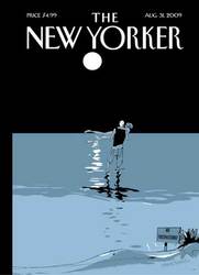
“No Trespassing!” a sign warns, as a couple wades into the surf at nighttime. It is a forbidden tryst, involving the romance of a midnight hour and a private beach to which they are not allowed access. The sign is small and ineffective; the power of love and lust is not.
It is a _New Yorker_ cover in which the cool grays, whites, and blacks of the coloring are working against the hot passion of a couple who may be about to make love in the surf. There is a touch of danger in the air, and as is usually the case with _New Yorker_ covers, a touch of mystery as well.
Danger lurks in the air. I can’t help thinking that, yes, the couple may be intent on a sexual thrill, but the moonlit pathway to the sea seems also to lead to death -either by murder or by suicide.
As one blogger has “written”:http://stevereads.blogspot.com/2009/08/in-penny-press-new-yorker-31-august.html, Banyai’s cover “manages to be romantically touching despite the fact that it automatically summons to mind the open scene of _Jaws_.”
The cover of the August 31, 2009 issue of _The New Yorker_, called “No Trespassing,” seems to be a parody of a romantic moonlit scene. A full moon is a commonplace symbol of romance and romantic trysts. Don’t lovers ever fall in love beneath the glow of a waxing gibbous or third quarter moon?
The cover’s artist is “Istvan Banyai”:http://www.istvanbanyai.com/, a Hungarian-born artist who now lives and works in New York and Connecticut. As Banyai has “remarked”:http://www.chroniclebooks.com/Chronicle/excerpt/0811846083-e0.html, “I like visual, I think visual.” His children’s book “_Zoom_”:http://www.hemmy.net/2008/05/02/zoom-picture-book-by-istvan-banyai/ is all about visuals: the book is composed of a slow and steady zooming out over the course of many pages.
Body language is everything. The legs of the woman are not draped gracefully and seductively across her man’s arms. She seems to flail rather gracelessly in the night air. Her knees are pointed against one another. Her pose is ungainly.
Nevertheless, her face is turned towards him, her eyes closed, her lips ready. She seems to be entirely naked. Her partner is clothed. Instead of a white tux or _From Here to Eternity_ swimming trunks, however, the man wears a tank top and shorts that sag unattractively down his buttocks.
Banyai’s May 6, 2002 “cover”:http://www.cartoonbank.com/product_details.asp?mscssid=N75BLQT1QCKS9NR183NUWJWU397MBJ28&sitetype=1&did=5&sid=51407&pid=&keyword=Istvan+Banyai§ion=all&title=undefined&whichpage=1&sortBy=popular also depicted a couple who made up for any lack of elegance with sexual passion: the boy wears an ill-fitting tank top that reveals skinny arms and a belly button.
The girl wears a summer dress, a bandanna, and no bra. She extends a long arm around him; his arm simply hangs across her shoulders. They kiss in a city street infused with a creamy yellow and with people bustling off to work. The commuters are boring and bored, and their nipples aren’t showing.
Banyai’s drawings of intertwined couples place the focus on their bodies, on their physicality. His couples are not perfect physical specimens, just regular couples who have managed to find a moment of passion and sexuality.
Where are they? Are they, perhaps, on one of Martha’s Vineyard’s coveted “key beaches”? These are beaches that require a key to get in, but according to this “article”:http://www.bostonphoenix.com/archive/features/99/07/29/VINEYARD_BEACHES.html, people still manage to sneak in. Gates are scaled, keys are duplicated and hidden under rocks, and visitors “accidentally” wander onto association beaches.
The rules regarding beach trespassing seem to be a little hazy, although most authorities consider public property everything seaward of the mean high water line–the mean high water line being the average level of the high tide line over the last 19 years.
There is no political or social message on the cover, and Banyai’s cover is not about beach property rights at all. (In any case, even an advocacy group like “C.R.A.B.”:http://www.crabnj.org/2.html, the Citizens’ Right to Access Beaches, declares very categorically the following: “We respect the rights of private property owners and do not advocate trespassing.”)
The cover’s intent is to evoke a scene of romance, of sex and danger. It is about the thrill of public nudity. It is about the thrill of wearing any old thing, or nothing at all, and still having someone who wants you.
Banyai’s couple does not seem to be worrying about high tide levels and property rights. They are trespassing and transgressing. Love, or at least lust, is in the air.
Sempé Fi (On Covers): Bridge to Nowhere
_Pollux writes_:
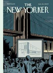
There is a feature playing in an outdoor theatre alongside the Brooklyn Bridge. Tickets are free. All are welcome to come. Flickering on the screen is a shot of the Brooklyn Bridge itself. The audience is entranced. It is a diverse crowd. No one looks at the actual bridge looming behind the improvised cinema.
A movie under the stars makes for a decent Saturday night, maybe a good “second date” or “third date” sort of outing.
Why look up at a marvel of engineering when you can see it on a much smaller screen? No craning of the neck is required; you can see it as you see most of the world: through streaming videos on the CNN website, through newly uploaded Snapfish albums, through the muted flash of Kindle screens.
For the August 24, 2009 cover of _The New Yorker_, “Adrian Tomine”:http://www.adrian-tomine.com/ makes a statement about our world. It is a world in which life and culture seem to be permanently plugged into any device that has a screen: films, iPods, television, and computers. We could spend our whole day viewing, viewing, and viewing some more, and this has become the stuff of life itself. It is life not led but LED, a light-emitting diode existence.
René Magritte created the same sort of imagery and made the same sort of comment in the two paintings called “_The Human Condition_.”:http://www.uh.edu/~englmi/BorgesBaroqueIllusionism/index.html These paintings depicted paintings: in them an easel stands before an open window. The painting on the easel depicts the very same landscape it is concealing. It depicts and conceals it at the same time. Magritte thus toys with reality and our conceptions of it. The painting on the easel is no more and no less real than the landscape behind it.
Tomine’s Magritte-like cover is appropriate to our times. His Brooklyn Bridge is not real; it is simply a depiction of it. Is it any less real than the film that portrays it? Is the film a documentary or a feature film starring the It Girl of the moment?
Our world is a world in which Facebook friendships seem more vigorous and more affectionate than the flesh-and-blood variety. As the ever-waggish Andy Borowitz once “joked”:http://www.youtube.com/watch?v=4cRCHNmoOws, he loves his Facebook friends because they would never betray him as his real friends would.
Are we becoming a world in which reality on the screen is becoming more real than flesh, blood, stone, and brick?
Will battles between nations become transformed into cyber-attacks, in which the websites of embassies are hacked and cities themselves are left untouched and un-bombed? No, that is wishful thinking. It seems that only the good things in life are being transferred to the world of small screens: friendship, architectural works, and concerts.
Tomine’s “last cover”:http://emdashes.com/2009/01/sempe-fi-winter-keeps-us-warm.php for _The New Yorker_, for the January 31, 2009 issue, depicted a different night scene: an ice-cream salesman braving the cold to sell his product, in which light and warmth emanate from the truck that serves as a refuge from the screaming winds.
Tomine’s new cover is equally incongruous, but not obviously so. Tomine makes his point gently and subtly, much like Bruce McCall. Tomine and McCall are the diametric opposites of artists like Blitt, who make their point with hammer blows. _The New Yorker_ needs both types of artists.
We don’t live in an entirely virtual world. The shock of reality always intrudes upon our iWorld of little screens and _Next_ buttons. Perhaps that is just as well. We are alive; what we see on the screen is not.
Sempé Fi (On Covers): South of the Highway
_Pollux writes_:
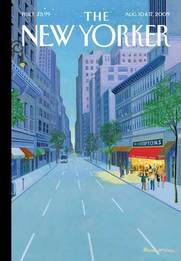
A new themed restaurant has opened in town: _The Hamptons_! Come for the atmosphere without dealing with all the hassles of the real place. When you visit the restaurant, there’s no need to get stuck in traffic on the narrow rural road that materializes after the bridge over the Shinnecock Canal.
There’s also no need to find a place to stay during the crowded summer months. Walk or take a taxi to the restaurant. No muss, no fuss. The scene at the actual place has been “dampened”:http://www.observer.com/2009/daily-transom/checking-georgica-restaurant-and-lounge somewhat by the recession, anyway.
Yes, The Hamptons Restaurant has all the social charms of the real thing and none of the natural charms. There’s no view of Lake Agawam or the hamlets of Water Mill, Sagaponack and Wainscott, but you can settle in for “the season” for just a few pleasant hours. The restaurant has no off-season. Come with friends, come alone. You’re at “The Hamptons,” not The Hamptons.
“Bruce McCall’s”:http://www.brucemccall.com/ restaurant provides access to a social scene–and access to a name. “The Hamptons,” after all, is a name that evokes affluence, expensive zip codes, and plutocratic privilege. To attach the name to a decidedly unspectacular location on an ordinary city street is to attempt to rub a patina of exclusivity on an otherwise ordinary eatery.
McCall thus detaches the name from the place, and challenges us to think of what “The Hamptons” really means. Would the name mean the same to us if it were not associated with the 30-mile string of resorts along the South Fork of Long Island? Does the restaurant retain any of the glamour of the place after which it was named?
As the great American toponymist “George R. Stewart”:http://en.wikipedia.org/wiki/George_R._Stewart writes in his landmark _Names on the Globe_, “Though a place may be conceived as existing in itself or as standing in the consciousness of an animal, a place-name exists only with men, being a part of language…”
Thus, the wide sandy beaches and cornfields and salty air that make up the geographic region of The Hamptons exist in themselves, with or without this famous name. But “The Hamptons” is a name that exists only in the minds of men and women, especially in the minds of the good people of New York.
The people who patronize this restaurant seem happy enough. McCall creates a cheery, convivial atmosphere. The restaurant literally glows with gentle yellow light, casting a beam of happy radiance onto a gray, lonely street. Maybe the customers are happier there than they would have ever been in Long Island, with no traffic, no snobbery, and no distance with which to contend.
As always, McCall creates a quietly detailed scene, making a comment without overstating his point. With McCall’s artwork, one drinks in the scene little by little, as if taking in the layout of a model train set.
Yes, a new themed restaurant has opened in town. The food’s okay. But don’t come for the butter-bathed lobster, stay for the name.
Sempé Fi (On Covers): Into the Wild

_Pollux writes_:
“Alex Melamid’s”:http://en.wikipedia.org/wiki/Alexander_Melamid cover for the August 3, 2009 issue of _The New Yorker_ is called, simply, “Siberia.” Melamid’s painting is not one of _The New Yorker_’s humorous or political covers. The meaning of his landscape cover only becomes apparent when one reads the issue’s Reporter at Large piece–and reads it in full.
Inside the covers of the August 3, 2009 issue is Part One of “Ian Frazier’s”:http://en.wikipedia.org/wiki/Ian_Frazier “Siberian journey.”:http://www.newyorker.com/reporting/2009/08/03/090803fa_fact_frazier In many ways, Frazier is plunging into the unknown. It truly is, as _The New Yorker_ describes it, the “ultimate road trip.” Starting in St. Petersburg, Frazier crosses the Urals to Tobolsk and beyond, in a lurching Renault step van with his guide Sergei Mikhailovich Lunev.
Melamid’s cover thus introduces an element of mystery that refers to the mystery of Siberia itself. Despite the increasing smallness, or flatness, of the world, Siberia remains a land of mystery to Westerners, a _terra incognita_ of taiga and tundra.
The very name “Siberia” conjures up images of remoteness, of nuclear tests, of gulag archipelagoes, of distant, cold cities with names like Omsk and Tomsk, and, as Frazier comments, of strategic places on the _Risk_ gameboard. “The Kamchatka Peninsula controlled the only crossing of the game board’s narrow sea between Asia and North America, so gaining Kamchatka was key.”
Siberia is a vast region marked here and there with the relics of the past and the realities of the present. On the start of his journey, in Vologda, in Western Russia, Frazier comes across “the only life-size statue of Lenin in the world. It looks painful as if the powerful Bolshevik had simply stood on a pedestal and been bronzed alive.”
In Melamid’s cover, Lenin stands before a nondescript, tumbledown house. There are no worshiping crowds or bouquets at Lenin’s feet, only an indifferent cow. “The main four-legged animal I encountered in Siberia was the cow,” Frazier writes. “Siberian cows are skinnier than the ones in America, and longer-legged, often with muddy shins, and ribs showing.”
Melamid’s brushstrokes capture the riddle that Russia still represents. Should we feel threatened by this land of life-sized statues and skinny cows?
Melamid, born in Moscow in 1945, was a co-founder, with “Vitaly Komar”:http://en.wikipedia.org/wiki/Vitaly_Komar, of the Sots Art movement, a Russian parallel to Pop Art and a satirical rendering of Socialist realism. Instead of paintings of admiring schoolchildren giving roses to Stalin, Melamid and Komar “inserted themselves, for example,”:http://www.komarandmelamid.org/chronology/1972/index.htm and their families into the forms and images of the state-approved Socialist realism.
Sots Art adopted, as explained in “this piece”:http://www.ivyparisnews.com/2007/11/sots-art-politi.html, “the aesthetic methods of state-approved art to express non-conformist sentiments”, utilizing the vibrant Soviet symbols (the hammer and sickle, the military uniforms, the star, the color red) for purposes of pop art rather than propaganda. Practitioners of this form of deconstruction included not only Komar and Melamid, but also Erik Bulatov, Il’ya Kabakov, Dmitry Prigov, Aleksey Kosolapov, and Leonid Sokov.
Melamid and Komar were arrested in 1974 during an art performance. Soviet authorities destroyed some of their works, and the two artists were working in the United States by the late 1970s. The two artists stopped working together in 2003. Recently, Melamid’s “_Holy Hip-Hop!_ solo exhibition”:http://www.mocadetroit.org/exhibitions/melamid.html attempted to capture the essence of hip-hop artists like Snoop Dogg, 50 Cent, Kanye West, and Reverend Run.
Melamid has been described as a revolutionary, a rebel, and a “cynical social realist.” However, I find his cover for _The New Yorker_ to be less satirical and irreverent and more nostalgic, almost sentimental.
Naturally, with the fall of the Soviet regime, creators of Sots Art no longer had a power structure and its accompanying symbols to lampoon and subvert. Melamid has thus turned to new power-brokers such as Snoop Dogg and away from those such as Leonid Brezhnev.
Nostalgia for the Soviet era emerged as soon as the Soviet era had ended. Lenin and Stalin were no longer objects of fear but representatives of a bygone era of superpower status. Today, affluent young Muscovites “buy”:http://www.nytimes.com/2007/11/27/world/europe/27designer.html?_r=1&bl&ex=1196830800&en=891f7f26514c44ff&ei=5087%0A overcoats bearing hammer-and-sickle buttons, retro USSR Olympic tracksuits, and jewelry minted to look like Soviet kopecks.
In the same way, Melamid’s cover has not been created, as Sots Art has been “described”:http://www.komarandmelamid.org/chronology.html, in “a unique version of Soviet Pop and Conceptual Art, which combines the principles of Dadaism and Socialist Realism” but instead is simply a literal imagining of Frazier’s words on Siberia, tinged with nostalgia for the Soviet past.
Frazier’s cows and Lenin statue are not described as being in the same town. Melamid has instead created a vision that combines Frazier’s reporting into one single canvas.
Melamid’s cover is thus not an attack on a repressive Soviet regime but an interpretation of the Russia of 2009: an intriguing combination of great strength and size and also a place of strong nostalgia, of ecological desolation, of empty steel barrels and scuttled ambitions.