
Emily Gordon writes:
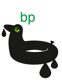
Remember the contest Greenpeace UK announced to redesign the BP logo? Our own cartoonist Pollux beat them to it, of course, but now that the official contest is closed, you’ll want to go look at the entries. From the Greenpeace UK Flickr page:
BP claim that they are ‘beyond petroleum’. But this is a company that is up to its neck in the dirtiest oil going – poised to invest in the Canadian tar sands, and causing environmental catastrophe through deepwater drilling.
Their nice green logo doesn’t really seem to fit them too well, so we ran a competition to find a logo that we could use to rebrand BP.
The results are displayed here.
Some of the entries are pretty good, especially the ones that depart from the green-and-yellow starburst motif and try something more conceptually daring, like the droplet surrounding an oil-covered hand (“not waving but drowning,” as the Stevie Smith poem goes) and the tagline “be patient.”
Or this designer’s clever and poignant approach–a repetition of BP’s logo and the text, “I still love your logo,” then a note in small type below: “I wish your oil rigs were designed as well as your brand identity.”