
From today’s New York Post (via MediaBistro): “Tina Brown has turned to legendary avant-garde design firm Number 17 to handle her new yet-to-be-named Web venture, a news-aggregation service that is being backed by her longtime friend, media mogul Barry Diller.” I can attest both to No. 17‘s design acumen and their laudable foosball hosting and playing skills.
Elsewhere in design, journalism and political science double major (and keyboard player) Teddy Applebaum, given the challenge of a mock blow-in card, struggled among various versions of Rea Irvin’s New Yorker typeface and their cost (“oodles of cash”), and had to settle for a poor imitation. Occasional spelling oversights aside, I think the kid‘s got something, don’t you?
Speaking of blow-in cards, there was an eloquent defense of them in Wired some months ago that I keep thinking about, and not just because of the witty execution. It seems the cards really bring in the dough, and in these uncertain times, that’s something we’ve got to support (as this Jack Ziegler cartoon suggests), right? Or at least not judge too harshly, especially when in the forest, which could probably use more edifying reading material, anyway.
Category Archives: X-Rea: Irvin Type Watch
Will the Winners of the Tilley Contest Also Appear in the Magazine?
I dunno, but this post by Len at the Jawbone Radio Show in Cleveland, who’s been notified that one of his entries has been selected as a winner of the Eustace Tilley competition (congratulations!), makes me curious. Len writes: “The art will be published on Monday on the New Yorker.com and there is a slight chance that I may make it into the print edition as well. I’ll be sure to publish more info as soon as I know it.” A little gallery in the print edition would be a treat, but even if the winners’ circle is online-only, it’s been a great contest for all involved. I’m sure Rea Irvin would have been thoroughly amused.
In case you were wondering, or, as the wise Cary Tennis would say, Since You Asked, I only repeat conjectures I hear from outside the magazine and Condé Nast generally, specifically those already reported elsewhere. That is, I ignore most of them, but I make note of the ones I think dedicated readers of The New Yorker will find interesting. As Jean Hagen once said in her corrosive platinum, “What do they think I am, dumb or something?” More to the point, don’t we have enough of a gossip culture as it is?
People Like Winners
That’s why we should be writing about John Edwards now. We had something to learn from the fairly extensive coverage of Rudy Giuliani‘s disastrous campaign, and now we have something to gain from looking back at the results of Edwards’ approach and the details of his inconveniently mellow-harshing story and concerns. I want to hear about what he’ll do next. Don’t discount him just because we love a bullfight.
Does God exist? Tonight Christopher Hitchens and Rabbi Shmuley Boteach are debating it at the 92nd St. Y. I’ll be there. Potential highlights include God, appearing Marshall McLuhan-style, strolling onstage to declare to Hitchens, Boteach, the audience, or some combination of the above, “You know nothing of my work.” (Afterward: While that didn’t happen, exactly, there were certainly insults a-flyin’.)
At least we can be confident that Eustace Tilley exists, as did his creator, Rea Irvin; as Jason Kottke reports, the winners of the Tilley retooling contest have been notified. I’ve been enjoying the discussions on the contest’s various Flickr threads; entrants commune, commiserate, and praise with Threadless-like generosity and swap ideas for drawings that coulda been. Dan Savage has gotten involved, too. This contest has clearly been a hit—what’s next in user-generated interactoolery, do you suppose?
Finally, my carnivorous friend Paul Lukas has updated Joseph Mitchell’s juicy, tender, and well-done ode to the beefsteak (as Paul explains, “The term refers not to a cut of meat but to a raucous all-you-can-eat-and-drink banquet”)—which you can reread in Secret Ingredients: The New Yorker Book of Food and Drink—with a sizzling, bacon-wrapped Times story (with video!) on how we beefsteak now. Sorry, cows of the world (and environment, etc.); I apologize from the bottom of my ostensible soul, and I’m saving you for special occasions these days, but in the list of things that are sacred, I’m going to have to include the occasional indulgence in just this sort of ritual.
Found in the Chapter Menu: The President’s Analyst
The President’s Analyst, written and directed by Theodore J. Flicker and starring James Coburn in the title role, was released in 1967—which fact is screamingly evident in virtually every frame. I saw a big chunk of it many years ago, and in my mind it’s always remained a mashup of Dick and I Love You, Alice B. Toklas! with a little bit of Skidoo thrown in. (We learned recently that David Denby is a big fan of Otto Preminger—I’d love to know what he makes of Skidoo.)
Let’s be frank: The President’s Analyst is kind of a mess. Its hallmark is the sort of hysterical puerility much better carried off some years later in The In-Laws. Watching the DVD (and enjoying the movie about as much as I had), Friend of Emdashes Jarrett noticed something odd: the people responsible for the DVD menu, rather than select some swirly go-go typeface, as seen in for instance the poster, went with a close approximation of Irvin. (In the poster, the title is set in the shape of an analyst’s couch, which is one of those “good” ideas better off relegated to the dustbin. You can see this idea carried over in the words “Scene Selection.”)
Jarrett kindly provided Emdashes with some screengrabs. Here they are:
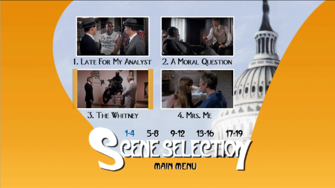

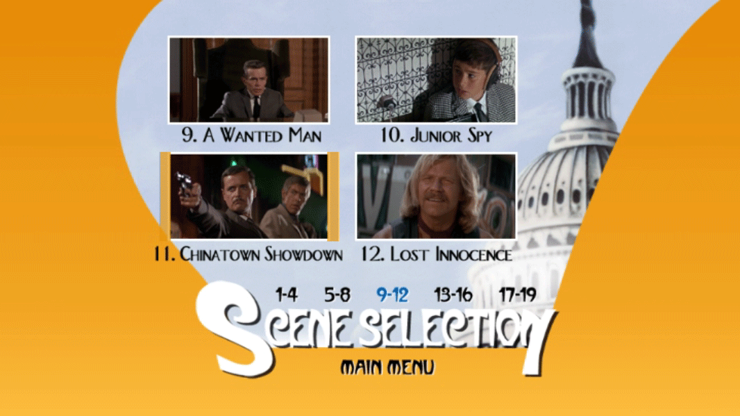

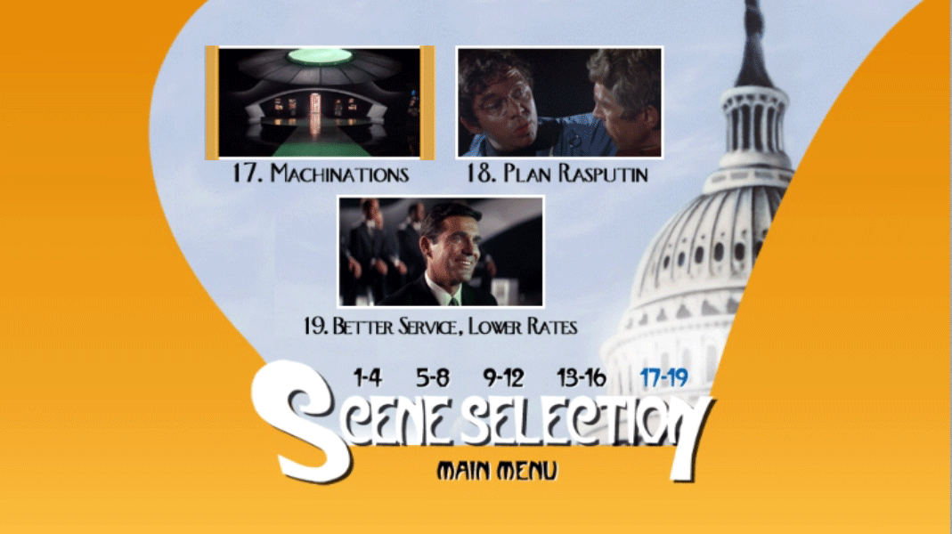
It’s not quite a perfect match, I don’t think, but it’s very close. Nice to see my distant relative Dwayne F. Schneider there in that final chapter. Oh, here’s that silly couch lettering:

And here’s a random still from the movie with Coburn jamming on some kind of gong:

Incidentally: what did The New Yorker make of the movie, anyway? Brendan Gill reviewed it in the January 6, 1968, issue. He didn’t like it either:
“The President’s Analyst” … has a fine idea for a comedy, which it wantonly tosses away…. From the moment the analyst turns up in a fright wig at a folk-rock party, the movie loses control of itself and pitches headlong into greater and greater exaggeration.
Exactly.
—Martin Schneider
We Want Bread and Irvin, Too
Back in August—my, how time flies—our friend and illustrator Jesse Ewing wrote in with a Rea Irvin type sighting for the Emdashes column devoted to this activity:
Hi Emily,
Not sure if you’re still doing your X-Rea category, but I’ve got an entry that kind of blew my mind.
See attached picture. In our defense, we had to get white bread to make proper BLTs.
Jesse (and wife Chelsea)

I’d like a BLT right now, actually. Anyway, Gwyneth Dyer, writer for the communications design agency Larsen, has just noted this sliced Rea-lette on her marketing blog, mentioning (thanks!) our slow but steady X-Rea machine. She notes:
I’m wondering if this was a purposeful decision — to align a bakery brand with a sophisticated weekly magazine of literature, current affairs, and humor. Perhaps the brand manager’s thinking went like this: Customer needs to pick up some bread. Customer is overwhelmed by choices on grocery shelf. Customer spots a bread that seems somehow familiar, almost classic, possibly a bit more erudite than the other white breads….
She goes on to ask, “What’s your opinion? Is this typeface off limits? Is using it unfairly capitalizing on The New Yorker brand?”
I’d like to toast Jesse, Chelsea, and Dwyer for this excellent find. Pictured is Jesse’s own photograph of the spongy bread; Dyer has a close-up on her site, too. Please email in your own Irvin-esque type sightings, and if you’ve got a photo, screen grab, or scan, all the better!
Steinberg Appropriation Hunt! (Reader Participation Alert)
Our friend Jennie, owner of one terrific Saul Steinberg homage, writes,
Have you seen the Brooklyn version of the famous view? It’s more a view of than from, but it’s on display at Prints Charming in Park Slope, on 4th Street just east of 5th Avenue. It’s by Warren Linn, if I’m reading my notes correctly.
Since Park Slope is a little bit out of our way, we’ve decided to ask our enterprising readers to verify this bit of Steinberg-spotting.
So listen up: Anyone (not just the first person) who sends a gif or jpg file of this poster to martin at the above domain will receive a handsome selection of stickers featuring obscure players from the German Bundesliga.
If you do choose to visit Prints Charming, by all means be polite and maybe purchase a small item for their trouble. Not that we expect anything less from our readership. —Martin Schneider
Infamous (Almost) and the Ransom Note Approach
I saw Infamous, the “other” movie about Capote, tonight, and I must say I liked it. I happened to get a gander at the movie poster and got a snootful of faux Irvin font! So close, close, close. It’s clearly not quite Irvin—and equally clearly, intended to evoke same.
T’other day I linked to a 2003 post on Maud Newton’s sharp media blog; if you look at her masthead image, you’ll see some authentic Irvin font peeking back at you. —Martin Schneider
Ask the Librarians (VI)
A column in which Jon Michaud and Erin Overbey, The New Yorker’s head librarians, answer your questions about the magazine’s past and present. E-mail your own questions for Jon and Erin; the column has now moved to The New Yorker‘s Back Issues blog. Illustration for Emdashes by Lara Tomlin; other images are courtesy of The New Yorker.
Q. When did The New Yorker start publishing letters to the editor? Did it publish letters in any form before that?
Erin writes: The Letters to the Editor department has had several incarnations at the magazine. In the twenties and thirties, the magazine published occasional letters to the editor, but no consistent weekly column from readers. These early letters were usually quite brief and appeared under headings like “The Amateur Reporter” or “Our Captious Readers.” Some of them were actually parodies written by New Yorker staffers under pseudonyms; a typical example is this excerpt from a letter, written by “Rye Face,” in the March 13, 1926, issue:
That smart New Yorkers read your confounded paper may be true. But why imply that decent people would become smart if they read it? Dammit, I read it. And I am a bootlegger. And practically all bootleggers and others with a sense of humor read it. Accept my sincerest expressions of disgust. THE NEW YORKER is not smart. Please have the decency to cease from accusing the honest people who support your senseless waggery with their good cash of vices they don’t possess. We may not be perfect but God knows we aren’t smart.
From the forties through the early nineties, letters to the editor would occasionally appear in the back of the magazine, usually identified as Departments of Amplification. Those who wrote letters to the magazine during this period include Eudora Welty, John McNulty, George S. Kaufman, and Thomas Mann. The following is excerpted from a letter written by Eudora Welty and published as a Department of Amplification in the January 1, 1949, issue. Welty is responding to Edmund Wilson’s review of William Faulkner’s Intruder in the Dust (1948):
How well Illinois or South Dakota or Vermont has fared in The New Yorker book-review column lately, I haven’t noticed, but Mississippi was pushed under three times in two weeks…. Such critical irrelevance, favorable or unfavorable, the South has long been used to, but now Mr. Wilson fancies it up and it will resound a bit louder. Mr. Faulkner all the while continues to be capable of passion, of love, of wisdom, perhaps of prophecy, toward his material. Isn’t that enough? Such qualities can identify themselves anywhere in the world and in any century without furnishing an address or references…. Mr. Wilson has to account for the superior work of Mr. Faulkner, of course he has to, and to show why the novelist writes his transcendent descriptions, he offers the explanation that the Southern man-made world is different looking, hence its impact is different, and those adjectives come out. (Different looking–to whom?) Could the simple, though superfluous, explanation not be that the recipient of the impact, Mr. Faulkner, is the different component here, possessing the brain as he does, and that the superiority of the work done lies in that brain?
In October of 1992, with Tina Brown’s first issue, the magazine began occasionally publishing single letters under the heading “Mailbox.” The first stand-alone Letters to the Editor column, titled “In the Mail,” ran in the October 4, 1993, issue. The weekly column was renamed “The Mail” in the January 20, 1997, issue. Today, the magazine receives about one hundred letters to the editor per issue, and every letter is read by someone on the editorial staff. Usually, the letters editor selects three or four for the weekly column. The criteria for choosing a letter vary, but typically the editor is looking for something that furthers or clarifies a point in the piece or is an interesting addendum. Some of the people who have written letters to the magazine in the past fifteen years include Norman Mailer, Erica Jong, Colin Powell, Stephen Sondheim, Gore Vidal, Arthur Schlesinger, Jr., and Dick Cavett.
Q. Did The New Yorker always publish a pre-holiday “On and Off the Avenue”?
Jon writes: Each year, for most of its history, The New Yorker has published holiday shopping guides under the “On and Off the Avenue” rubric. Until the early nineties, these gift guides appeared annually over several issues in November and December, broken up into such categories as gifts for children, gifts for the house, holiday food, and wrappings and trimmings. During the Second World War, the magazine ran, earlier in the year, a guide to gifts for men and women in the armed forces. The pre-Christmas gift guides were written by the regular Avenue correspondents: Lois Long, Sheila Hibben, Marion Miller, Barbara Blake, Cecil Webb, and Kennedy Fraser. In the nineteen-eighties, Lynn Yaeger, Cynthia Zarin, Andy Logan, and Mary D. Kierstead contributed. Since the mid-nineties, the column has run occasionally; Patricia Marx has published gift guides the last two Decembers.
The style of these columns has been consistently direct and pragmatic. “Paging Mr. Claus,” a pre-Christmas guide from the December 7, 1929, issue, warns readers, “Please don’t phone us for information, and if it’s peace you want, shop early in the morning.” The column sums up Hammacher Schlemmer like this: “Labor-saving devices a specialty. Innumerable electrical tricks; all kinds of hardware; anything for kitchens.” When it comes to buying beauty products for wives, the column writer suggests, “If you know her preferences, you need read no further.”
The writer of a 1944 column on gifts for servicemen and -women notes: “Women on tropical stations must have cotton lingerie, such as Lord & Taylor slips ($3.95)…. For girls in cold climates, Macy has two-piece pajama suits, knit like balbriggan and cut like ski pants; $3…. Navy nurses, poor things, must wear black cotton or rayon stockings. Saks has them.” The writer goes on to suggest gifts for soldiers in hospitals. “Sleight-of-hand paraphernalia delights both men who are bedridden and those able to get around. You can easily assemble a bag of tricks yourself.” Six months later, Lieutenant Alton Kastner wrote a letter to the magazine from the South Pacific critiquing some of the suggestions: “Fruitcake is ‘surefire,’ you say. One mammoth fruitcake we got was sadly massacred by our industrious little insect friends…. Only ten per cent of the hundreds of fruitcakes arrived in edible condition.”
In later decades, the columns were less list-like and more discursive. Andy Logan’s “Under the Children’s Christmas Tree,” from December 9, 1985, considers the new fad of including documentation such as “birth” certificates with dolls, ascribing the trend to the pervasive influence of Cabbage Patch Kids. Later, commenting on a “Peanuts” anthology, she quotes Umberto Eco, who said of Charlie Brown and friends, “They are the monstrous, infantile reductions of all the neuroses of a modern citizen of the industrial civilization.”
In her recent columns, Patricia Marx has brought back something of the lighter touch of the gift guides’ earliest years. In her 2005 guide to holiday gifts for women, Marx puts forward the following theory:
Everything costs so much these days that everything starts to seem cheap. Speaking as a pretend economist, I must explain that this is because the rate of real inflation cannot keep up with the rate of inflation in one’s head. And so when a person hears of a brownstone going for twelve million, even a person who happens to gulp at the monthly mortgage on her puny one-bedroom, she finds herself thinking, What a bargain! Maybe I should buy that!
Q. Who have all the cartoon editors been over the years? Are they all cartoonists themselves? Is the cartoon editor the same as the cover editor and the art editor?
Erin writes: The New Yorker‘s first art editor was Rea Irvin, the illustrator and cartoonist who created Eustace Tilley–the monocled dandy who appears on the magazine’s cover each February–and was the driving force behind the magazine’s graphic identity and early artistic innovations. Irvin, along with a few other staffers, met with editor Harold Ross every Tuesday afternoon, from 1925 to 1951, to peruse the weekly submissions of covers, cartoons, illustrations, and so on. In 1939, James (Jim) Geraghty, a cartoon-gag writer at the magazine, was hired as art editor, and Irvin was from that point on known as the art director. Irvin continued to sit in on art meetings throughout the forties, but he left the magazine after Ross’s death in 1951. From the fifties until his retirement in 1972, Geraghty oversaw all art in The New Yorker and acted as the liaison between the cartoonists and the magazine. Some of the artists he nurtured during that period include Peter De Vries, Charles Addams, Saul Steinberg, George Booth, William Steig, Ed Koren, and Charles Barsotti.
In 1972, William Shawn hired the cartoonist Lee Lorenz, who had worked for Geraghty since 1958, as art editor, and Lorenz retained that position until 1993, when he became cartoon editor. During his tenure, which ended with his retirement in 1998, Lorenz cultivated such artists as Jack Ziegler, Roz Chast, Jean-Jacques Sempé, Bruce Eric Kaplan, and Michael Crawford. Bob Mankoff, Lorenz’s successor as cartoon editor, has been a cartoonist at the magazine since 1977. Mankoff also runs The Cartoon Bank, the leading searchable database of cartoon humor on the web. In his nine years as cartoon editor, Mankoff has fostered cartoonists like William Haefeli, Carolita Johnson, Drew Dernavich, Alex Gregory, Matthew Diffee, and David Sipress.
Caroline Mailhot, the current art director, joined the magazine in 1992, and, with the design consultant Wynn Dan, adapted the magazine’s design to incorporate photography and a wider use of illustration. She continues to be responsible for the overall design of the magazine and of each issue. Françoise Mouly assumed responsibility for covers when she was named art editor in 1993. Elisabeth Biondi, the visuals editor, oversees photography, and Christine Curry, the illustration editor, oversees the assignment of illustrations.
Q. Is The New Yorker available on audio?
Jon writes: There are several ways to access content from The New Yorker on audio. A weekly audio edition, with a selection of pieces from the week’s issue of the magazine, is available online from Audible.com. Listeners may buy individual issues or an annual subscription. A typical week’s content might include the Comment, two Talk stories, a Shouts & Murmurs, two feature stories, and a movie review. Audible also offers packages of recordings from The New Yorker Festival.
Under the “Online Only” tab on The New Yorker‘s web site, browsers will find a list of recent Q. & A.s with New Yorker writers as well as Audio Slide Shows and the Fiction podcast, a monthly feature in which a current New Yorker fiction writer selects and discusses a story from the magazine’s archive.
Podcasts of The New Yorker‘s audio content are also available for free through the Apple iTunes store and other podcast sites (and via RSS readers). In addition to the monthly Fiction podcast mentioned above, the magazine produces two weekly podcasts. The New Yorker Out Loud features the Q. & A.s and other audio content from the web site. The Comment Podcast contains a reading of the week’s commentary column from the magazine (produced by Audible). Readers can also subscribe to these podcasts via The New Yorker‘s RSS page.
Associated Services for the Blind produces recordings of articles from newspapers and magazines, including The New Yorker. A recent visit to the ASB web site revealed that The New Yorker was among the top ten best-selling items in their Braille and Audio Resource Center. Like Audible, the ASB records selections from the magazine, rather than the contents of an entire issue.
Perhaps best of all, each year you can hear New Yorker writers read their work in person at The New Yorker Festival, whose 2007 program can be found here.
Q. I know that Lois Long created Tables for Two. When was that, and what were some of the restaurants she reviewed? Who started writing it after her, and when did the tradition start of different staffers (or freelance writers) doing weekly reviews?
Erin writes: The magazine’s Tables for Two department was originally called When Nights Are Bold, and it included reviews of nightclubs and speakeasies as well as restaurants. Charles Baskerville wrote the column, under the pseudonym Tophat, until July 18, 1925, when Lois Long took over, writing under the pen name Lipstick. The column was renamed Tables for Two in the September 12, 1925, issue. Long, a former Vanity Fair reporter, brought a lively and effervescent tone to the column, which typically ran to two or three pages. That tone is reflected in this excerpt from a review she wrote about Harlem’s Cotton Club in the May 4, 1929, issue:
Another thing that your most high-hat friends have recently discovered in a body is the Cotton Club in Harlem, which has a perfectly elegant revue that goes on at twelve-thirty and again around two o’clock. I fondly think that this revue…is the reason for their presence there–I cannot believe that most of them realize that they are listening to probably the greatest jazz orchestra of all time, which is Duke Ellington’s–I’ll fight anyone who says different. It is barbaric and rhythmic and brassy as jazz ought to be; it is mellow as music ought to be. There are throbbing moans and wah-wahs and outbreaks on the part of the brasses, and it is all too much for an impressionable girl.
In addition to the Cotton Club, Long reviewed most of the upscale hot spots of the Jazz Age, including the Stork Club, the Four Seasons, Tavern on the Green, the Rainbow Room, and the Algonquin. Her last Tables for Two review ran in the May 28, 1938, issue. After that, the column was written by other New Yorker staffers, including David Lardner and the prolific R. E. M. Whitaker, until February of 1963.
The magazine also published a separate Restaurants column, written by Sheila Hibben and Katherine Blow, which began in 1935. That department reviewed restaurants as varied as Grand Central’s Oyster Bar, “21,” Pete’s Tavern, and the Russian Tea Room. The Restaurants column ran for just seven years, but Tables for Two reemerged, as an occasional department, in the Goings On About Town section, beginning in May of 1995. It expanded to a weekly department, still in GOAT, in the spring of 2000. Today, the column is written by a rotating group of five or six staffers.
Q. What is the origin of the vertical band of solid color that appears on the left side of every cover of The New Yorker?
Jon writes: That vertical band is known as the cover strap. The strap was included in Rea Irvin’s design for the first cover in 1925, and it has appeared on every New Yorker cover since. Usually the strap is rendered as a solid column of color, but over the years a number of artists have used it as a way of ornamenting or enhancing their illustrations. Some notable uses of the strap include the August 6, 1927 cover by Ilonka Karasz depicting a concert at the Central Park bandshell. The strap contains passages from a musical score.

More recently, for his January 8, 2007 cover “On Thin Ice,” Ivan Brunetti accentuated his drawing of a young girl skating on a shrinking ice floe with smaller visions of global warming in the strap, including a polar bear sipping a drink in front of a fan and an igloo with a melted roof.

Addressed elsewhere in Ask the Librarians: VII: Who were the fiction editors?, Shouts & Murmurs history, Sloan Wilson, international beats; VI: Letters to the editor, On and Off the Avenue, is the cartoon editor the same as the cover editor and the art editor?, audio versions of the magazine, Lois Long and Tables for Two, the cover strap; V: E. B. White’s newsbreaks, Garrison Keillor and the Grand Ole Opry, Harold Ross remembrances, whimsical pseudonyms, the classic boardroom cartoon; IV: Terrence Malick, Pierre Le-Tan, TV criticism, the magazine’s indexes, tiny drawings, Fantasticks follies; III: Early editors, short-story rankings, Audax Minor, Talk’s political stance; II: Robert Day cartoons, where New Yorker readers are, obscure departments, The Complete New Yorker, the birth of the TOC, the Second World War “pony edition”; I: A. J. Liebling, Spots, office typewriters, Trillin on food, the magazine’s first movie review, cartoon fact checking.
Vista del Mondo (Or: Steinberg in Italian)
A couple of weeks ago I mentioned seeing a Viennese version of Saul Steinberg’s incomparable cover “View of the World From Ninth Avenue.” A reader named Jennie posted in the comments that she owns a shirt picturing the same sort of witty vista, only for Florence. She was good enough to send us a snapshot so that we could show it to you.
Here it is!
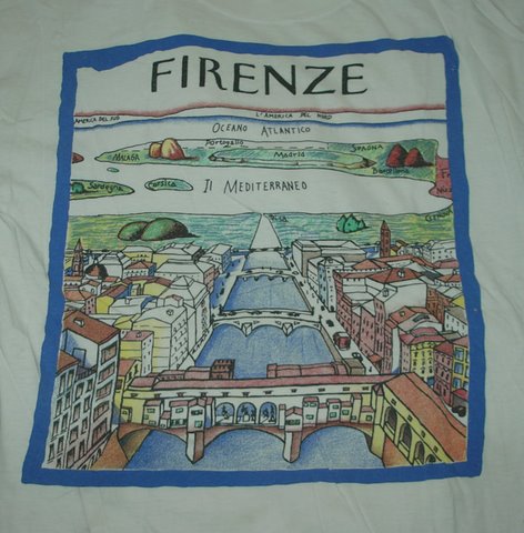
Jennie relates that the shirt “inspired me a few years later to make one of my own: A View of the World From Ancient Rome. The artwork can’t compare, of course, even with the knockoffs, but it was fun.” Alas, she doesn’t have that shirt anymore. We still appreciate the contribution—thanks!
Needless to say, if any readers are aware of similar appropriations, we’d love to hear about it. There must be versions of this for Chicago, Los Angeles, London, Paris, and who knows where else!
The one I want to see is Dubuque. —Martin Schneider
We’ve been neglecting the “X-Rea” category lately, I know, but if you’ve sent in a sighting of an Irvin-like face and haven’t seen it on the site, rest assured, we’ll be posting it with enthusiasm. For newcomers to this category, please be on the lookout for Irvinesque letters. They’re everywhere! —EG
Signature Rea Irvin
…well, Rea Irvin’s signature. That’s a chiasmus you can take to the bank!