Monthly Archives: December 2009

“Addams Family” Musical: People Come to See ‘Em–They Really Are a Scream

ADDAMS FAMILY PORTRAIT SKETCH.jpg

©Charles Addams/With permission of Tee and Charles Addams Foundation


Emily Gordon writes:
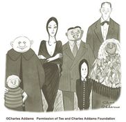
Our friend Ben Bass, who most recently reviewed some very cartoony characters at the Chicago Humanities Festival, reports that the new musical The Addams Family officially opened onstage tonight. The Chicagoans are an hour earlier, so naturally they got to see it first. Bass writes:

The Addams Family is a new musical starring two-time Tony winners Nathan Lane and Bebe Neuwirth, now running in an eight-week Chicago tryout en route to Broadway. Officially opens Wednesday but previews are underway. My Flavorpill preview is here. I also attended the show’s opening press conference last spring, where I got the skinny on Charles Addams and his macabre characters’ New Yorker magazine pedigree. Read about it here.

I recommend that you follow his links. They’re excellent and not a bit scary, and they are free of boiling oil, a surfeit of heir, grave-playing children, and manic moustaches. Here’s what Gothamist reported when the show was first announced. They link to a photo of the Addams family (lowercase f) house that likely inspired the artist’s spookatorium.
Meanwhile, this is a very funny Addams-related cartoon-creation story by our friend Carolita Johnson, a.k.a. Newyorkette. And I smiled when I happened on this little collection of contemporary cartoons, by Mark Parisi, full of playful twists on the positively ooky family.
Related on Emdashes: I reviewed the most recent Charles Addams biography; Ben critiqued the redesigned Cartoon Bank and wrote up the 2009 and 2008 and 2007 New Yorker Festivals.

The Importance of Knowing What You’re Good At

Benjamin Chambers writes:
Reading some old hard-copy issues of The New Yorker dating from the 1990s, I ran across the “Postscript” piece by Lee Lorenz on George Price, from the January 30, 1995 issue.
I grew up with Price’s angular cartoons and his quirkily dry sense of humor— and since the guy did over 1,200 drawings for the magazine between 1929 and his death, many people alive today can say the same—so I was stunned to learn that “only one [of his cartoons], amazingly, was based on an idea of his own.”
What Price was good at was drawing, and so he used punchlines that were supplied for him. It wasn’t that uncommon to use gag writers, but I’d guess the frequency with which he did so was, and the way the results do seem to be so of-a-piece, as if the punchlines and the drawings really were the product of a single mind.
It’s telling, I think, that the one drawing that was based on his own idea was a sight gag, and didn’t have a punchline. It appeared on the cover of the December 25, 1965 issue, and can be seen below. (Click the link at left to find it on The Cartoon Bank; click on the image below to see a larger version.)
Geo-Price_TNY_12-25-65.JPG
The same 1995 issue of TNY that contained the homage to Price also featured David Owen’s profile of software entrepreneur and art patron Peter Norton (Norton Utilities, anyone?). I read the profile at the time the issue came out, and for the past 15 years, it has stood out in my memory as an excellent portrait of a bright, highly unusual man. One of the amusing things in the piece:

Nerd tycoons differ from robber barons … If there had been no such thing as petroleum, John D. Rockefeller would surely have found some other means of becoming stupefyingly wealthy. But if there had been no computers, what would have happened to guys like [Bill] Gates and Norton? Norton suspects that he might have ended up either as “an angry cab-driver with a Ph.D.” or as a paper-shuffling minion of some faceless corporation, much as his father was. The fact that big companies were beginning to use computers at the very moment Norton entered the job market was a hugely propitious accident for him— like becoming a teen-ager in the year they invented French-kissing.

“Cartoonists Are Artists”

4166418344_0b6af6d2c3_o.jpg
Emily Gordon writes:
Courtesy of one of my favorite blogs, Leif Peng’s “Today’s Inspiration”–which you can, and should, get as a daily email full of vintage magazine covers, illustrations, comics, ads, and all-around cup-spiller-overs–here’s a statement with which we can heartily agree, expressed in words by Richard Taylor (writing in American Artist in October 1950) and in pictures by good old Hank Ketcham.

The Top Ten: Algonquin Round Table Power Rankings

_Pollux writes_:
Jillian Lovejoy Lowery and Howard Megdal come up with unscientific “rankings”:http://perpetualpost.com/?p=3654 measuring the greatness of the members of the Algonquin Round Table.
Some of these stars have dimmed since their heyday, and Lowery and Megdal discuss whether Alexander Woollcott, for example, deserves to be “buried by history” or whether Franklin P. Adams deserves his current obscurity. Dorothy Parker is no. 1 on both posted lists.
Emdashes readers, post your own rankings here!

Sempé Fi: O Christmas Tree

VanDerVeken_HolidayCheers_12-7-09.JPG
_Pollux writes_:
The genial faces of the December 7, 2009 issue of _The New Yorker_ provide welcome warmth in the coldness of a winter made bleak by war and woes both economic and political. “Holiday Cheers” is the name of the cover, and its artist is the Belgian illustrator “Jan Van Der Veken.”:http://en.wikipedia.org/wiki/Jan_Van_Der_Veken
Van Der Veken’s couple is literally wrapped up in holiday cheer. Unlike the gray passers-by behind them, who are weighed down with packages and briefcases, the young man and woman are fresh-faced, happy, and hopeful. They seem to be joyfully conscious of what the holiday season actually means: togetherness.
In their blissful state, they scarcely notice the layers of snow that have settled on their headwear.
Van Der Veken’s large red ribbon swirls about magically. It gently encircles the happy young couple and the Christmas tree they carry. This is the only purchase they consider important. They don’t care about Black Fridays, Cyber Mondays, or Restock Tuesdays.
Van Der Veken’s retro-modern style lends itself well to this image of optimism and hope. This Belgian illustrator is a practitioner of _atoomstijl_ (“Atomic Style”), a throwback to the _ligne claire_ style first popularized by that other Belgian illustrator, Hergé.
The “Atomic Style” is both retro and futuristic at the same time, evoking a postwar era in which a fascination with nuclear power and rocket science made anything seem possible. The couple is wearing clothes that evoke the 1950s era, a time when men wore fedoras and white gloves and women Chanel suits or Christian Dior jackets.
Pioneered by Yves Chaland, Ted Benoît, Serge Clerc, and Floc’h (who also created a _New Yorker_ “cover”:http://emdashes.com/2009/03/sempe-fi-on-covers-elle.php this year), _atoomstijl_ or _style atome_ sweeps away any hint of cynicism and fatigue that the December 7, 2009 issue may have showcased in the hands of a different illustrator.
Jan Van Der Veken, who signs as “Jan VDV,” is young and energetic. As “this”:http://www.flandershouse.org/jan_van_der_vreken website proclaims, “the positive attitude towards technology and the unlimited possibilities in the future of that era is reflected in all of his works.”
In the short “documentary”:http://www.fabricagrafica.be/content/page.asp?a=SMALLFILMS featured on the website of his design company, Fabrica Grafica, we see him speeding along the streets of Ghent on a Vespa before we cut to footage of the artist in his studio.
Happy Holidays! The world may belong to the young, but a good holiday season belongs to us all.

Tears of a Clown: The Anti-Comic Sans Movement

_Pollux writes_:
We continue our “coverage”:http://emdashes.com/2009/04/the-plague-of-our-time-the-ban.php of the odium aimed at the font everyone loves to hate. No, not you, “Take Out the Garbage.”:http://www.dafont.com/take-out-the-garbage.font I mean of course Comic Sans.
Cameron Chapman, on the blog Six Revisions, “writes”:http://sixrevisions.com/graphics-design/comic-sans-the-font-everyone-loves-to-hate/ about why Comic Sans is hated so much, and shows some interesting visual examples of when the font has been used inappropriately. Chapman mentions that Comic Sans has seen wide and inappropriate usage, from a sign for a bone marrow transplant clinic to a grave marker.
Chapman also offers some alternatives to Comic Sans, like “Lexia Readable.”:http://www.k-type.com/?p=520 In the meantime, Comic Sans remains at large. Emdashes has committed an additional 30,000 typographers to address the problem.