The world of Emily Gordons is an honorable guild of creative workers, with only a few exceptions–and those exceptions get a free pass because they’re undergraduates and, lord knows, we would have made awful fools of ourselves if we had been online then. (By “we,” I mean “me.”) Notable Emily Gordons include the polymathically brilliant Emily Gordon, writer of Gynomite! and, among many other things, a licensed therapist who gives me platinum advice for free. And for more than a decade, I’ve been following the writing career of Emily Fox Gordon, whose beautifully crafted essays, fiction, and book-length nonfiction are a pleasure to read. Now she’s working on a new novel, and, speaking for all Emily Gordons, we are very excited to read it. –Emily Gordon
Author Archives: Emdashes
Even When It’s Bold Italic: Typefaces to Love and Serenade
“Obsessing about fonts is a form of procrastination, so of course I have indulged in it ever since I graduated from a TRS-80 Model III to a Macintosh.” –Caleb Crain
“The main thing, though, is to use some nonproportional typewriter-style font–you need the sentences to look their worst until the dress rehearsal of the galleys, when all the serifs come out dancing.”
–Nicholson Baker
Emily Gordon writes:
My Chicago actor pal, taking a break from rehearsing Speed-the-Plow, just pointed out this 2007 gem from Slate: “My Favorite Font: Anne Fadiman, Jonathan Lethem, Richard Posner, and others reveal what font they compose in and why.” I wonder if they’ve all changed their minds by now? Caleb, how about you?
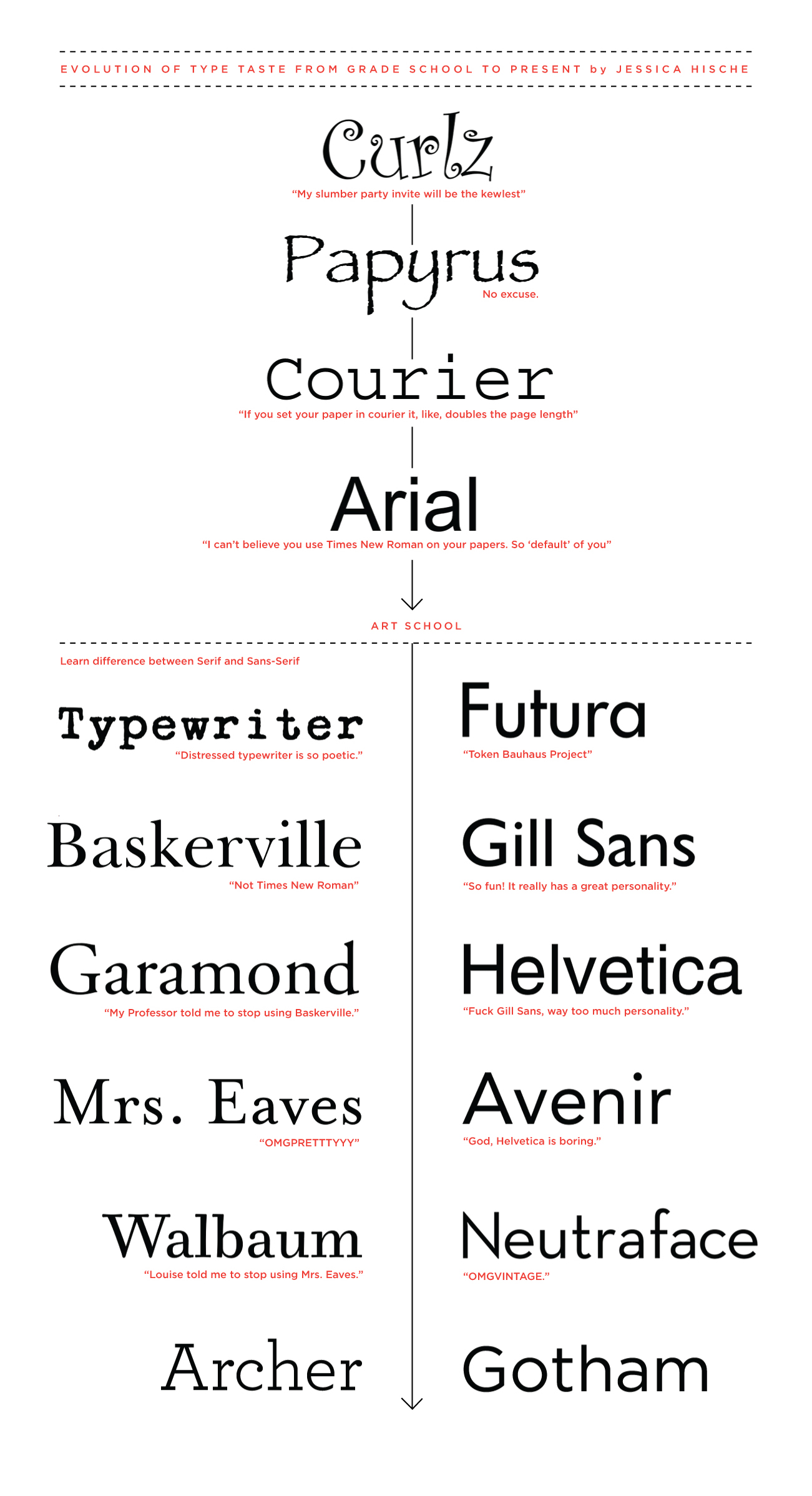
That thought sent me searching for this hilarious Jessica Hische post from earlier this year, a mini-autobiography of a typophile called “My Evolution of Type Taste from Grade School to Present”–click to enlarge and read her arch asides on questionable font attractions. Meanwhile, ambling along the googleway, I landed on this post about various other designers’ favorite faces.
All this brought me, musically and giddily, back to the song that is in my head 1) every time I see my sunscreen, which is called Sport Face, and 2) every time I hear Lady Gaga’s “Poker Face.” Yes, it’s DD40’s (Jason Kinney and Mark Searcy) Gaga-meets-typographer beards spectacular, “Neutra Face.” Here’s what Michael Conroy at the Wired U.K. blog wrote about it:
In a video that smacks of “it’s Friday afternoon, why not?” four guys have remixed Lady GaGa’s Poker Face into an homage to Neutraface, the light and airy modern font that I’m sure you’re all very familiar with…or perhaps not.
Either way, the sight of four hirsute men reimagining the Poker Face clip to perfection (“You’ll read my, you can read my Neutraface…even if it’s bold italic”) is sure to make you smile, not least their brilliantly choreographed moves portraying “bold” and “italic”, which should be licensed for use on dance floors everywhere.
Check out this and other songs DD40 have released – on cassette tape, no less – at their website.
I’ve seen this video several dozen times since it first rocked the world of fonty montys everywhere, and I still think it’s incredibly funny. And (as the YouTube commenters well know) damn sexy, too!
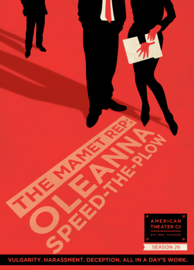
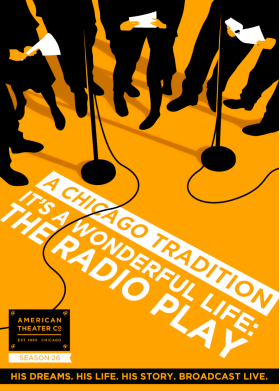
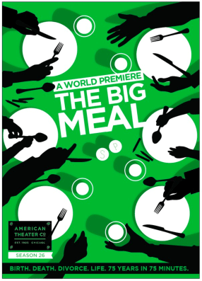
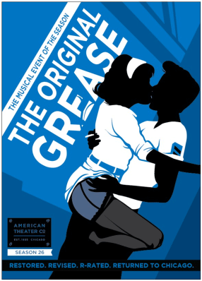
Speaking of design and Art, and Speed-the-Plow, aren’t these handsome posters for the American Theater Company’s new season? (Click on “the plays.”) If anyone knows who the designer is, let me know. (Update: DesignScout. Thanks Lance!) I will not be missing this (R-rated! sassy!) production of Grease.
Finally, check out this fantastic 1932 map of Harlem nightclubs, drawn by the cartoonist Elmer Simms Campbell. I love this for many reasons, including the appropriately prime spots for Cab Calloway and the Savoy Ballroom, and the hand-lettering is just so. Happy procrastinating!
¡Time’s Up! Put Down Your Pencils; Punctuation Will Now Answer Your Letters.
That’s our fervent hope, anyway. In the meantime, we’re sifting the nearly 150 entries into our write a letter to a punctuation mark contest. Mail call brought gladness to the ampersand, the grawlix, the Oxford comma, the underline, and everything (everyone? the marks have all been so brilliantly personified that we can no longer think of them as mere shapes on a page) in between. We’ll pick five top finalists this week and list them here, and we’ll want to hear what you think about it. Got a favorite entry? Have a beef to hoist? Tell us here!
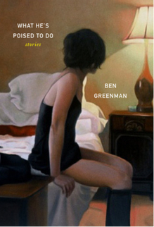
As you know, the final finalist will get a signed and hand-punctuated copy of Ben Greenman’s new collection of stories, What He’s Poised to Do. Mr. Greenman will choose the top letter himself. May the best mark win! –Emily Gordon
This Is the Last Day of Our (Fun Contest’s) Acquaintance
If you’re old enough to understand that reference, you’re old enough to write a letter to your favorite punctuation mark! If you’re not old enough, that’s OK; we would love to have, and if possible, exploit, your unique Gen-Y take on the matter. If you’re too old to have listened to a Sinéad O’Connor song sixty-five times in a row, we especially welcome your submissions, because you remember when paper was paper and music was music and people didn’t sprinkle around exclamation points so promiscuously. To all of you, we issue this grave but encouraging reminder: This is the last day to enter to win a signed, specially decorated copy of Ben Greenman’s book What He’s Poised to Do, and to win our hearts and the deep and eternal regard of your fellow man. We can’t wait to see what you do, but hurry. (No exclamation point, as a gesture of respect to our elders–for there are still, at the time of this writing, people older than ourselves.) –Emily Gordon
Very much related: National Punctuation Day.
Since We’re Obsessed With Punctuation at the Moment
…or, to be frank, always, we’d like to note this Slashdot story about the war between the sarcasm symbols. Yes, the sarcasm symbols. It sounds like a dirty fight for a low form of humor, but still, it’s correct that punctuation controversies should be in the news, at the top of the hour, above the fold (if not the fray).
–Emily Gordon
Who Will Win the Punctuation Popularity Contest?
Emily Gordon writes:
A few stars–and we don’t mean asterisks–are emerging in our punctuation-addressing contest to win Ben Greenman’s new book, What He’s Poised to Do. Here are the rankings of letter recipients so far, out of 82 entries and counting. What does this say about these marks, or about us as a society? We don’t know. All we know is, some of these little symbols are coming home with an armful of valentines (and a little hate mail), and some are Charlie Brown, weeping into their sandwiches. If you’re for the underdog, as we generally are, take a moment to send a note to, say, the solitary slash, or, for that matter, the ubiquitous but apparently invisible backslash. Send a salami to your manicule in the army! Keep those cards and letters coming.
The current rankings (to be updated frequently for those placing bets):
Ellipsis: 10
Semicolon (which has withstood some harsh attacks in the past): 8
Apostrophe: 7
Exclamation Point: 7
At sign: 3
Ampersand: 3
Asterisk: 3
Colon: 3
Parentheses: 3
Period: 5
em dash: 2
Grawlix: 2
Interrobang: 2
Manicule: 2
Question Mark: 2
Tilde: 2
Tied with one piece of fan (or unfan) mail each: acute accent, air quote, at-the-price-of, bracket, bullet, comma, curly quote, diaeresis, dollar sign en dash, exclaquestion mark, hyphen, interpunct, interroverti (formerly the inverted question mark), macron, percent sign, pilcrow, pound sign, quotation mark, smart quote, underline, Oxford comma.
No postcards, no wedding invitations, no junk mail, no J. Crew catalogue, no nuthin’: backslash, bullet, caret, copyright symbol, dagger, dash ditto mark, degree, ditto mark, double hyphen, inverted exclamation point, guillemets, lozenge, number sign (number sign! that’s the hashtag you use so shamelessly!), the “therefore” and “because” signs, slash, solidus, and tie.
Here are some stark and potentially upsetting images of those characters who have received no mail. Can you look into their fragile strokes and deny them the notice they crave?
\ • © ^ ° †‡ « » ï¼ ã€ƒ †◊ ∴ ∵ ¡ # / â„
Note: We realize that some of these marks are really less punctuation than they are typographical elements. But since they’re getting letters, or we think they should, we’re including them.
Resolved Answer: “I am obsessed with punctuation, why is this?”
Emily Gordon writes:
At Yahoo! Answers, the world is always ready with solutions, judgments, and miscellaneous gibberish. We would like to reassure “Lost.,” the writer of this lonely cry for help, that she is not alone, and should not despair! “What is causing this?” she writes. What’s causing this is a love for truth and beauty that will not be shattered by underminers, naysayers, and nattering nabobs of instant messaging, and nothing less. If only we could speak directly to her, we would invite her to enter our contest to write the best letter to a punctuation mark, which has 58 entries so far and counting.
Alas, she’s an anonymous anime illustration. In her honor, then, let’s write more letters to more punctuation marks, who are loved. Or sometimes (see below) threatened with legal action. You have till August 15 to enter, and, maybe, win Ben Greenman’s new book!
So You Love Punctuation? Write a Letter to Your Favorite Mark, and You Might Win a Copy of Ben Greenman’s Brand-New Book!
Update: We’ve announced the finalists, and the winner!
We loved every single letter to every single mark. Thank you!
Ben Greenman‘s new book, What He’s Poised to Do, was recently published by Harper Perennial, and critics are already hailing its mix of emotional sophistication and formal innovation. Just the tip of the iceberg: Steve Almond, writing in the Los Angeles Times, calls the fourteen stories in the collection “astonishing,” and Pauls Toutonghi at Bookslut calls them “beautiful”–even better, “a book so beautiful, you’ll feel mysteriously compelled to mail it to a stranger.”
The book, in large part, deals with letters: how they are (or aren’t) effective conveyances for emotional intimacy and truth. Along with the book, Mr. Greenman has launched a site called Letters With Character, which invites readers to write letters to their favorite fictional characters–most recently, Alyosha Karamazov, Madame Psychosis from Infinite Jest, and Ernest Hemingway’s Yogi Johnson from The Torrents of Spring.
Here at Emdashes, we love letters (especially those sent through the postal mail), but there’s something we love even more: punctuation. Indeed, when we discovered that the upside-down question mark–as in ¿Qué?–had no official name, we challenged you, our readers, to rename it, and now the frequent (you wouldn’t believe how frequent) googlers who seek this information know the answer: it is the interroverti, all thanks to you.
In the same spirit, we’re combining two of our top-ten passions in life and challenging you to write a letter to your favorite punctuation mark, or perhaps one you find elusive, insufficiently loved, or sound but overexposed. Tell it anything you want: your fears, your frustrations, your innermost desires. Then put it in the comments section below so we can read it, too. Deadline: August 16. (We know all too well that it can take a bit of time to write a good letter–or even a telegraphic telegram.)
Here is a partial list of possible correspondents, with the current tally of blushing recipients marked in bold, and also ranked here in descending order of popularity: the acute accent, the air quote, the ampersand (3), the apostrophe (7), the asterisk (2), the at-the-price-of, the at sign (3), the backslash, the bracket, the bullet, the caret, the colon (3), the comma, the curly quote, the dagger, the dash ditto mark, the diaeresis, the dollar sign, the double hyphen (which is perhaps not what you thought it was), the ellipsis (10), the em dash (2)–toward which some jurors are slightly biased–or the en dash, the newly coined exclaquestion mark, the exclamation point (7), the full stop (2), the grawlix (2), the hyphen, the interpunct, the interrobang (2), the inverted exclamation point, the interroverti (formerly the inverted question mark), the little star, the macron, the manicule (2), the number sign, the parenthesis (((3))), the percent sign, the period (3), the pilcrow, the pound sign, the question mark (3), the quotation mark (or a pair of them), the controversial semicolon (7), the smart quote, the slash, the tilde (2), the underline, the Oxford comma, or any other mark close to your heart but not listed here. We will select the best letter and award the writer a signed copy of Mr. Greenman’s book, which may in fact contain the beloved mark in question. He may even add an extra one just for you.
Remember: Post your letter in the comments below by August 16, and you’ll be entered to win a signed copy of this exceptionally satisfying book of stories by one of our favorite writers. The best of the entry letters will all be collected in a post of their own, with sparkles, blue ribbons, and plenty of punctuation. If you can’t wait till mid-August to find out if you’ve won, and/or have friends who love letters and will love this book, of course, you can also order a copy.
Posting tip: You can use basic HTML tags to make line spaces; try the paragraph and break tags, as needed. If you don’t know how or would like our help, we are obsessive editor types and are happy to right the spacing for you.
Art note: The painting on the book cover is by Alyssa Monks, whose portraits of women and men and bodies and children and water and funny faces are scorchingly beautiful.
Factual note: We realize that some of these marks are really less punctuation than they are typographical elements. But since they’re getting letters, or we think they should, we’re including them.
Related posts and links:
Short Imagined Monologues: I Am the Period at the End of This Paragraph. [Ben Greenman, McSweeney’s]
Exciting Emdashes Contest! ¿What Should We Call the Upside-Down Question Mark?
Our in-depth coverage of punctuation–five years and counting!
More Emdashes contests, giveaways, and assorted bunk
Is That an Emoticon in 1862? [NYT/City Room]
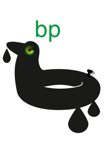
The BP Logo, Redesigned With Attitude
Emily Gordon writes:
Remember the contest Greenpeace UK announced to redesign the BP logo? Our own cartoonist Pollux beat them to it, of course, but now that the official contest is closed, you’ll want to go look at the entries. From the Greenpeace UK Flickr page:
BP claim that they are ‘beyond petroleum’. But this is a company that is up to its neck in the dirtiest oil going – poised to invest in the Canadian tar sands, and causing environmental catastrophe through deepwater drilling.
Their nice green logo doesn’t really seem to fit them too well, so we ran a competition to find a logo that we could use to rebrand BP.
The results are displayed here.
Some of the entries are pretty good, especially the ones that depart from the green-and-yellow starburst motif and try something more conceptually daring, like the droplet surrounding an oil-covered hand (“not waving but drowning,” as the Stevie Smith poem goes) and the tagline “be patient.”
Or this designer’s clever and poignant approach–a repetition of BP’s logo and the text, “I still love your logo,” then a note in small type below: “I wish your oil rigs were designed as well as your brand identity.”
On His Radio Show, Jonathan Schwartz Suggests a Renata Adler Set
_Emily writes_:
…Pitch Dark and Speedboat, in one volume, with an updated cover design (my suggestion). I think it’s a terrific idea. I’d buy it.