
Jonathan Taylor writes:
We noted the new book about the new book about the short-lived, full-throated, New Yorker–inspired Chicago magazine of the 1920s, The Chicagoan. But any chance to see more brash images from the mag is welcome: Here’s a slide show from Stop Smiling magazine (a stylish successor of sorts).
See especially the proto-Steinbergian “New Yorker’s Map of the United States,” and spot the tiny number of places that ≠ Dubuque. Reno, Nevada, didn’t seem to loom as large for The New Yorker as the map would suggest….
Category Archives: Looked Into
The New Yorker is Colbert’s Bench (The Password is “Tea”)
Martin Schneider writes:
More a “Looked At” than a “Looked Into,” perhaps. Stephen Colbert sure does heart The New Yorker lately. This week Simon Schama was on, promoting his book The American Future, and last week Paul Muldoon made an appearance.
Colbert made fun of Schama’s accent (“The Roh-mans?”) and asked Muldoon if parents get cranky when they learn their progeny intend to major in the insufficiently remunerative discipline of poetry. He and Muldoon read Muldoon’s poem “Tea” (from his book Madoc: A Mystery) together, and Colbert, upon learning that Schama is Jewish, asked whether tea is kosher.
Here are the clips:
| The Colbert Report | Mon – Thurs 11:30pm / 10:30c | |||
| Paul Muldoon | ||||
|
||||
| The Colbert Report | Mon – Thurs 11:30pm / 10:30c | |||
| Simon Schama | ||||
|
||||
Celebrate Pauline Kael’s 90th Birthday at the Cooler!
Martin Schneider writes:
Pauline Kael was born 90 years ago this Friday, June 19. Jason Bellamy of the Cooler, a website dedicated to “cinema ruminations,” has chosen to dedicate the week to the one critic who probably influenced more movie bloggers than any other (and many other writers and critics too).
All week long, he’ll be posting some of Kael’s more noteworthy reviews and then open the floor to discussion.
The inaugural post features Kael’s review of A Clockwork Orange, and focuses on her thoughts on violence in movies.
I think Kael is one of those people who’s so influential that her name doesn’t even come up that much; it’s like it’s superfluous. Kudos to Jason for bringing her name into view a bit.
As Jason says, the celebration lives or dies on the participation of others, so please, do go over and comment!
‘Imagine That Confronting You on a Newsstand!’ Creative Editor Creatively Lampooned
Jonathan Taylor writes:
The Daily Telegraph‘s obituary of the legendarily legendary editor of Flair magazine, Fleur Cowles, notes that she was the subject of a parodic piece in the New Yorker.
“The Hand That Cradles the Rock” (July 1, 1950), by S.J. Perelman, emits a chauvinistic condescension as it quotes at length an admittedly fawning portrait of Cowles (“‘I’m just a generally creative person,’ she says modestly”). But then follows a livelier speculative playlet, about an explosively innovative (and totally fictional) redactrix, Hyacinth Beddoes Laffoon, “queen-pin of the pulp oligarchy embracing ‘Gory Story,’ ‘Sanguinary Love,’ ‘Popular Dissolution’ and ‘Spicy Mortician.'” The scene finds Laffoon, “chic in a chiffon dress for which she herself spun the silk this morning,” in conference with the obseqious editorial assistants of her magazine, Shroud:
HYACINTH: First, these covers we’ve been running. They’re namby-pamby, no more punch than a textbook. Look at this one—a naked girl tied to a bedpost and a chimpanzee brandishing a knout.
BUNCE: I see the structural weakness. It demands too much of the reader.
But wait, here’s the beauty part—I mean, “The Beauty Part“—the full-length play that Perelman wrote his Laffoon character into, with five parts for Bert Lahr. Reviewing a 1992 Yale Rep revival, the Times said that “few flops have been as celebrated, mulled over and positively entitled to cult status,” but suggests:
In contrast to the capacity for self-reproachment of genuine contemporary artists, currently evidenced by “The Player,” the film about Hollywood backstabbing, and “Sight Unseen,” the play about sham in the art world, Perelman’s barbs about art as a commodity, the uncurbed need for self-expression and the mass marketing of culture — or to be an exact Perelmaniac, “Amurcan Kulchur,” are tepid indeed.
I wonder if that still the case, or might we benefit anew from a satire on
artists who do “collages out of seaweed and graham crackers,” or who sculpture in soap on “Procter & Gamble scholarships”; writers like one Kitty Entrail, “an intense minor poetess in paisley,” and suburban consumers (here Gloria and Seymour Krumgold) who commission a heat-resistant painting on Formica “as long as it doesn’t clash with the drapes.”
Take Part in the Tom Swifties Competition at Schott’s Blog!
Martin Schneider writes:
Yesterday morning Ben Schott kicked off a Tom Swifties competition at the New York Times website. It didn’t take me long to get quite swept up in the fun of composing them (I’d never really tried before), and apparently I’m not alone. A mere 36 hours later and there are nearly two thousand comments to the post.
Here are the ones I contributed (a few are pretty groan-worthy):
“Margaret Thatcher is the blame of this country’s problems,” said Nigel accusatorily.
“I’m going to carve an object out of this branch,” said Tom wittily.
“My favorite architect is from Spain,” said Tony gaudily.
“This list of great albums from the 1980s is missing Centerfold,” said Jay guilelessly.
“It is very important that we complete this dam,” Tom badgered the audience.
“These dumplings are delicious,” said Tom wantonly.
“I don’t really see the need for automobile insurance,” said Tom recklessly.
“Sis boom bah!” shouted Tom cheerfully.
“Which way is the ladies’ room?” asked Tom gently.
“I’d be interested in parting with the Minnesota Twins’ stadium at the right price,” the businessman said seldom.
“How am I going to affix this leaflet to this corkboard?” asked Tom tactlessly.
“I would never be able to find Italy on a map,” said Luigi bootlessly.
If nothing else, the competition may give our fecund Pollux ideas for a few delightful strips.
If you post any, by all means post them here as well!
Gratis Greens: The New Yorker’s Guide to Foraging
Jonathan Taylor writes:
Heirloom food culture is converging with the New Thrift, even if many practices, like shopping farmer’s markets and the home canning featured in the Times Wednesday, are most readily practiced by those with a surplus of time, if not money. The Wall Street Journal Wednesday charted a number of nutritious greens that were once commonly eaten but now proliferate, unnoticed and underfoot, in the guise of weeds. They’re had at greenmarkets for greenbacks, but are ripe for wider rediscovery as an opportunity for frugal foraging.
As the Journal notes, plants like purslane and sorrel went by the wayside by the mid 20th century, as “immigrants and rural Americans moved to cities, leaving behind both their gardens and their ethnic origins.” In 1943, during World War II days of rationing, The New Yorker‘s Sheila Hibben offered a timely reminder of “those perfectly edible greens which in happier times we called weeds.” Hibben’s “Markets and Menus” department was normally given over to the offerings of carriage-trade suppliers of glazed hams, cookies and wine.
- Milkweed: “as succulent and tender as any asparagus that has been made to grow by toil and patriotic enterprise” (Hibben raised the specter of the “shiftless country dweller” who might exploit “an untrimmed roadside” while “industrious Victory gardeners” labored away in their plots); to be harvested “just when the young shoots have pushed up to no more than six inches or so out of the ground.”
- Home-cut fern tips: “likely to be a fresher and altogether pleasanter green than the vegetable which used to come to town all worn out by the long trip down from Maine”; “serving them provides a satisfying pride and comfortable sense of living off the land.”
- Sorrel: “at this very minute is probably taking possession of your strawberry bed”; “Soft-cooked eggs or egg timables turned onto a bed of creamed sorrel provide as handsome a lunch dish as you could want of a hot day.”
- Dandelion: “only the very young dandelion leaves are edible and they must be cut far enough below the ground so that they are partly etiolated.” (???)
- Pokeweed shoots: “a slight, rather pleasant taste of iron”; “should be washed and carefully scraped and left in cold water for an hour”; “you had better look out” for poison in older plants. (The Journal says, “Eat with caution if at all,” cooking in at least two changes of boiling water.)
- Wild mustard: “more generally accepted socially,” and good boiled with bacon. (“If bacon makes too great a strain on the ration book, you’ll find that bacon rind, which has only a one-point value, adds the same rich flavor.”)
- Purslane: known as “pussley” by American farmers, and good “just to eke out a dish of boiled spinach.”
But note to New Yorkers: foraging in city parks is illegal without a permit, but there are sanctioned foraging tours by “Wildman” Steve Brill (Adam Gopnik went on one in 2007.)
Of Pixels and Pastels: New Yorker artist Jorge Colombo’s iPhone Art

_Pollux writes_:
If you call “Jorge Colombo”:http://www.jorgecolombo.com/, he may not pick up.
He’s busy using his phone for something other than talking, e-mailing, and finding directions. He’s creating artwork with his iPhone, whose Brushes feature is a sophisticated “mobile painting” application complete with color wheel, undo/redo functionality, and a selection of brushes.
This is powerful technology, and the Portuguese-born Colombo applies an artist’s sensibility to create immensely delicate and interesting iSketches that capture the city in a new medium. The iPhone has become one more tool in the artist’s kit. “I got a phone in the beginning of February, and I immediately got the program so I could entertain myself,” Colombo “remarks.”:http://www.newyorker.com/online/blogs/tny/2009/05/jorge-colombo-iphone-cover.html
But Colombo’s art isn’t gimmicky ephemera, and his art is not, thankfully, trapped on his phone. The June 1, 2009 “_New Yorker_ cover”:http://www.newyorker.com/online/blogs/tny/2009/05/jorge-colombo-iphone-cover.html is in fact a Colombo iArtpiece. He is also selling 20×200 iPhone drawings “at 20 x 200.”:http://www.20×200.com/aaa/jorge-colombo/
Colombo, born in Lisbon in 1963, is not a greenhorn graphic designer or emerging artist (not that there’s anything wrong with that), but an established illustrator, filmmaker, and photographer, who has worked as art director for various Chicago, San Francisco, and New York magazines. He has books under his belt, including the photographic novel “”Of Big and of Small Love””:http://www.jorgecolombo.com/bsl/index1.htm (”Do Grande e do Pequeno Amor”), a work of half-photography and half-fiction writing. iPhone’a Brushes app, then, is for him a new and useful tool rather than a replacement for camera or pen.
Paul Éluard once remarked that “the poet is not he who is inspired but he who inspires.” In the same way, Colombo is a poet who, no doubt, will inspire a new market for iPhone-generated art.
**James Falconer** “reports”:http://www.intomobile.com/2009/05/25/iphone-and-brushes-app-used-to-create-june-1st-cover-art-for-the-new-yorker.html on this story, and includes an image of Colombo’s cover.
The **Knight Center** “covers Colombo’s new artwork.”:http://knightcenter.utexas.edu/blog/?q=en/node/4118
Colombo’s isn’t the only one: the “iPhone Art Flickr group.”:http://www.flickr.com/groups/brushes/
Supreme Court Design Rules: Certiorari in Century, Please
Jonathan Taylor writes:
While we’re all talking about the Supreme Court: Anyone who has consulted an order or opinion on the Supreme Court’s site will know its attachment to the PDF, unsurprising given the format’s imperviousness to the vagaries of software. The staid, rather than stately, Century Schoolbook pages caged in one’s screen recall the defiance of David Souter amid the bells and whistles of Washington:
Turns out the court has some pretty stringent views on typography, and on the crafty task of assembling petitions, briefs and replies into little “booklets” for the justices to curl up with. From the Rules of the Court (PDF, natch, or HTML here):
Rule 33. Document Preparation: Booklet Format; 8½- by 11-Inch Paper Format
1. Booklet Format:
(a) Except for a document expressly permitted by these Rules to be submitted on 8½- by 11-inch paper, see, e. g., Rules 21, 22, and 39, every document filed with the Court shall be prepared using using a standard typesetting process (e. g., hot metal, photocomposition, or computer typesetting) to produce text printed in typographic (as opposed to typewriter) characters. The process used must produce a clear, black image on white paper. The text must be reproduced with a clarity that equals or exceeds the output of a laser printer.
(b) The text of every booklet-format document, including any appendix thereto, shall be typeset in Century family (e.g., Century Expanded, New Century Schoolbook, or Century Schoolbook) 12-point type with 2-point or more leading between lines. Quotations in excess of 50 words shall be indented. The typeface of footnotes shall be 10-point or larger with 2-point or more leading between lines. The text of the document must appear on both sides of the page.
(c) Every booklet-format document shall be produced on paper that is opaque, unglazed, 6 1/8 by 9 1/4 inches in size, and not less than 60 pounds in weight, and shall have margins of at least three fourths of an inch on all sides. The text field, including footnotes, should be approximately 4 1/8 by 7 1/8 inches. The document shall be bound firmly in at least two places along the left margin (saddle stitch or perfect binding preferred) so as to permit easy opening, and no part of the text should be obscured by the binding. Spiral, plastic, metal, and string bindings may not be used. Copies of patent documents, except opinions, may be duplicated in such size as is necessary in a separate appendix.
What’s more, there’s color-coded scheme for all those different types of supplications: your ordinary Petition for an Extraordinary Writ goes under a white cover, but a Brief for an Amicus Curiae in Support of the Defendant, Respondent, or Appellee, on the Merits or in an Original Action at the Exceptions Stage has got to be “dark green.” If you’re not sure what “light red” is, or you want to make sure your unglazed “tan” chapbook fairly screams “Brief Opposing a Motion to Dismiss or Affirm,” well, “The Clerk will furnish a color chart upon request”:
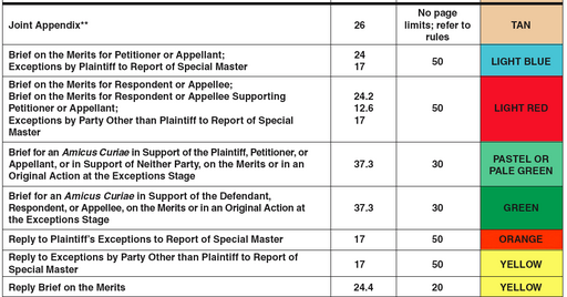
But note, it’s up to Counsel to “ensure that there is adequate contrast between the printing and the color of the cover.”
(In contrast, I’m a little surprised that, when it comes to adhering to word-count limits, “The person preparing the certificate may rely on the word count of the word-processing system used to prepare the document.” I wouldn’t want to test Clarence Thomas’s generosity with that rule.)
Via the promising site Typography for Lawyers, Ruth Anne Robbins, author of the manual (keep that Adobe Reader open) “Painting with Print,” suggests that the high court’s strictures might be necessary in light of lawyers’ slovenly word-processing habits. From the Journal of the Association of Legal Writing Directors, it’s a passionately footnoted plea for visually illiterate attorneys to wake up and smell the hot metal.
What is Ray Charles’ Favorite Font?: Get Your Typographunnies
The answer to that riddle: Georgia. Because it’s on his mind. You’ll find other “typographunnies,” as well as games and pasttimes, at a “website”:http://type.salsen.com/ described as an “acute gesture of typographic appreciation.” Have fun!
You Don’t Have to Read Gawker to Know That Americans Are Short
Emily Gordon writes:
Gawker notes today that an Organisation for Economic Co-operating and Development study is reporting alarming (to some) news that Americans aren’t getting taller, even though people in the other countries in the OECD (including Canada and the U.K.) are inching steadily upward.
But New Yorker-ophiles will remember Burkhard Bilger’s findings back in April 2004, in his Reporter at Large called “The Height Gap.” Bilger writes, in part:
Walking along the canals of Amsterdam and Delft, I had an odd sensation of drowning–not because the crowds were so thick but because I couldn’t lift my head above them. I’m five feet ten and a half–about an inch taller than the average in the United States–but, like most men I know, I tend to round the number up. Tall men, a series of studies has shown, benefit from a significant bias. They get married sooner, get promoted quicker, and earn higher wages. According to one recent study, the average six-foot worker earns a hundred and sixty-six thousand dollars more, over a thirty-year period, than his five-foot-five-inch counterpart–about eight hundred dollars more per inch per year. Short men are unlucky in politics (only five of forty-three Presidents have been shorter than average) and unluckier in love. A survey of some six thousand adolescents in the nineteen-sixties showed that the tallest boys were the first to get dates. The only ones more successful were those who got to choose their own clothes.
…
The average American man is only five feet nine and a half–less than an inch taller than the average soldier during the Revolutionary War. Women, meanwhile, seem to be getting smaller. According to the National Center for Health Statistics–which conducts periodic surveys of as many as thirty-five thousand Americans–women born in the late nineteen-fifties and early nineteen-sixties average just under five feet five. Those born a decade later are a third of an inch shorter.
Just in case I still thought this a trivial trend, Komlos put a final bar graph in front of me. It was entitled “Life Expectancy 2000.” Compared with people in thirty-six other industrialized countries, it showed, Americans rank twenty-eighth in average longevity–just above the Irish and the Cypriots (the Japanese top the rankings). “Ask yourself this,” Komlos said, peering at me above his reading glasses. “What is the difference between Western Europe and the U.S. that would work in this direction? It’s not income, since Americans, at least on paper, have been wealthier for more than a century. So what is it?”
Well, which would you rather read, some chart or the mellifluous Bilger? I’m going to read this one again, and for the record, I’m 5’7″ on my very best days.