Category Archives: Looked Into

Mad Men Recap Ritual Reading: This Week’s High Point

_Emily writes:_
Of the assorted Mad Men recaps I read every week, New York magazine’s are often my favorite. I interrupt myself to say, though, that the first one I read each week, and very nearly hyperventilate while waiting for, is Mark Lisanti’s matchless, dirty Mad Men Power Rankings, which are less recaps than they are manic fanfic, or meta-dystopias, or thought balloons kidnapped from the dank shadows of the writers’ room.
Then, throughout the week, I savor the Slate TV Club dialogues, which I love; letter-writing and -answering is still such a civilized form, and the correspondents’ sign-offs always make me laugh. Plus, the Slate trio (Michael Agger, John Swansburg, and Julia Turner) often cite reader comments and research, which is classy. You’d be a fool to miss James Wolcott’s (and others’) recaps at Vanity Fair, which include a playful plaint on the weary burden of recapping that is, as a friend of mine says, “the stuff of an S. J. Perelman Greatest Hits.” In the same column, Wolcott writes, elegiacally, of Sally:

I hate seeing Sally cry; there’s something so pure and defenseless about her plight. She’s either going to evolve into a saint forged in suffering or develop telekinetic powers and turn their next residence into a house of flying daggers, converting her mother into a lovely order of shish kabob. Either way, we’re pulling for you, Sally! Your tears shall not spill in vain!

I also enjoy the Lemondrop recaps, which have an appealing carefree zest but are sometimes a little sloppy. I can wait a few episodes to catch up with the Movieline recaps and Entertainment Weekly‘s “Mad Men Central,” though I relished EW‘s “‘Mad Men’: Unpacking ‘The Suitcase.'” Correct me if I’m wrong, but is EW a couple of episodes behind? Think of the people, like me and Duck Phillips, prone to the shakes!

Anyway, back to the always expertly composed and deeply considered writing on the show from New York. I thought this was an especially elegant, and relevant–see the Observer‘s recent instant classic “So Sorry To Do This! Flakiness Epidemic Sweeps Digital New York”–graf from Logan Hill this week:

This season, the show has become more critical of the actual conditions of Madison Avenue. Abe was the first character to really embody a hard-left critique of the ad world (only Midge’s bohemian critique came close) with his “Nuremberg on Madison Avenue” jeremiad. There are a whole lot of historians and sociologists, like David Montgomery (or Christopher Lasch, whose Haven in a Heartless World: The Family Besieged seems especially pertinent to this episode) who might be frustrated by the way a lot of the period arguments we fans have had about Mad Men — in terms of women in the office and work-life balance, and gender roles and so forth — tend to occlude the macro-level changes in the ways Americans work. We talk about how Betty’s a bad parent, and Don’s a bad parent, but rarely about how the way work — and, particularly, this kind of obsessive Manhattan work world — is eclipsing all other sorts of power and order, requiring and overtaking more and more of people’s values and lives. When, at a funeral, there’s more talk of money than religion, more talk of work trips than the journey to the afterlife, the show’s making a point.

Read the rest. This is rewarding, satisfying television criticism. That’s not an implied slight to anyone else’s (I hate the blog idiom sometimes–it’s so binary), but here’s to Logan Hill for doing this so well. Meanwhile, can someone pay Mark Lisanti to blog all day? I’m sure he has better things to do, but it would make a major contribution to my quality of life.

See also: 5 Other Necessary Mad Men Tumblrs, from Movieline.

Good Riddance to Summer’s Tomatoes

Jonathan Taylor writes:
Tomatesalacreme.jpg
At the markets here in New York, there are still plenty of tomatoes to be had, but you can tell the season is on the wane. Thank God. I am tired of summer’s tyranny of ingredients over the cooking process, of avoiding actual cooking due to the stifling weather—and simply tired of all the tomatoes, however delicious for eating raw or cooked into a simple pasta sauce.
It is time, in autumn, to reacquaint ourselves with the civilizing process. A tomato dish that I made both Saturday and Sunday is the way to bid a fond but firm farewell to the tomato, and submit nature to the genius of cookery. In other words, the tomatoes are cooked with cream. It is also a recipe whose modest nature and brusque expression are foreign to the didacticism and the sentimental mugging found in so much food writing these days.
First, the recipe, and then some notes on its source:
Tomates à la crème

Take six tomatoes. Cut them in halves. In your frying pan melt a lump of butter. Put in the tomatoes, cut side downward, with a sharply pointed knife puncturing here and there the rounded sides of the tomatoes. Let them heat for five minutes. Turn them over. Sprinkle them with salt. Cook them for another 10 minutes. Turn them again. The juices run out and spread into the pan. Once more turn the tomatoes cut side upward. Around them put 80 grams (3 ounces near enough) of thick cream. Mix it with the juices. As soon as it bubbles, slip the tomatoes and all their sauces onto a hot dish. Serve instantly, very hot.

In 1967, Elizabeth David wrote an article about French cookbook author Edouard de Pomiane for the London Sunday Times that was also published in Gourmet in March 1970 (perhaps it can be found in the new Gourmet iPad app?), and in David’s 1984 collection An Omelette and a Glass of Wine. It includes those verbatim instructions of Pomiane’s for tomates à la crème.
As David notes of the dinner menu that Pomiane presented tomates à la crème as a part of, it is “a real lesson in how to avoid the obvious without being freakish” and “how to start with the stimulus of a hot vegetable dish.” Even once I had just read the recipe, it was easy to picture as a canonical bistro classic. But that was not the case; David wrote that it “makes tomatoes so startingly unlike any other dish of cooked tomatoes that any restaurateur who put it on his menu would, in all probability, soon find it listed in the guide books as a regional speciality.” But the Pomiane attributed the dish to his Polish mother, and David notes that many of his techniques are actually traceable to Central European cooking—”thereby refreshing French cookery in the perfectly traditional way.”
David was also out to praise Pomiane’s way of food writing: “courageous, courteous, adult. It is creative in the true sense of that ill-used word, creative because it invites the reader to use his own critical and inventive faculties.” Like her own writing it, it resists promiscuous superlatives, emotional self-indulgence and much cant surrounding authenticity: “He passes speedily from the absurdities of haute cuisine to the shortcomings of folk cookery, and deals a swift right and left to those writers whose reverent genuflections before the glory and wonder of every least piece of cookery-lore make much journalistic cookery writing so tedious.”
A more practical virtue of the tomates recipe is that it will come in handy even when you’re not up to your ears in Greenmarket heirloom tomatoes. Those will certainly make the dish better, but it is also a recipe that can make something much more presentable out of inferior supermarket tomatoes. Take Julian Barnes’s word for it:

I didn’t much trust this: the quantity of butter was imprecise, the strength of the gas unspecified. Further, it was mid-February, so the best tomatoes I could find were pale orange, frost-hard, and pretty juice-free inside. I fanatically observed the approximations of De Pomiane’s recipe, while chucking in a little salt, pepper and sugar in the tiny hope of not disgracing the kitchen … and the result was unbelievably good – the method had somehow extracted richness from half a dozen fruits that looked as if they had long ago mislaid their essence.

Design Declaration: Zara Arshad’s 60+ Years Project

_Pollux writes_:
Some interesting designs, in the form of 70mm x 80mm mini-boards, are being created for the “60+ Years Project.”:http://www.zara-arshad.com/60years/
Organized by Zara Arshad, a multi-disciplinary British designer currently based in Beijing, the project has invited designers from all over the world to commemorate the 60th anniversary of the Universal Declaration of Human Rights.
Designs that have already been submitted can be seen “here.”:http://www.flickr.com/photos/zara-arshad/sets/72157612150707997/ Enjoy!

Two Quick Hits: Orlean and Wright

Martin Schneider writes:
Over the past three weeks or so, I encountered two New Yorker contributors in unexpected venues, and in both cases the takeaway was that the person might be the best at what they do. I thought I’d pass those on.
On August 11, the vastly entertaining mostly-political discussion website bloggingheads.tv posted a “diavlog” with Elizabeth Gilbert (Eat, Pray, Love) and Susan Orlean (billed as “Julia Roberts” and “Meryl Streep,” har har). It’s the third dicussion for bloggingheads.tv Orlean has done—the first two were with Kurt Andersen and Walter Kirn (“George Clooney”)—and she has a tremendous knack for “casual” conversation that is in fact studded with wit and wisdom. She is really good at these things.
At the 2007 New Yorker Festival, I had the great luck to see Orlean and Mark Singer conduct a “master class” in the art of writing profiles; that session was transcendently wonderful, one of the best NYF events I’ve ever seen, particularly for a New Yorker junkie. Orlean is deceptive: At first blush, she gives off a mildly distracted, breezy impression, but the more you listen, the more you realize how incredibly high this woman’s signal-to-noise ratio is. Over and over again, one is struck by the sheer number of acute observations, proferred with grace and insight.

Last week, at Talking Points Memo, Josh Marshall posted a “bleg” in which he asked his readers for guidance in finding a good, non-polemiized narrative account of the events leading up to 9/11. The overwhelming winner (as a piece of journalism) was Lawrence Wright’s The Looming Tower. This was a revelation to me, on a few levels. First, I had not actually known that that was the subject of The Looming Tower. But more interestingly, according to TPM’s readers, The Looming Tower is pretty much the only thorough, journalistic treatment of the 9/11 attacks.
Also in 2007, Emily and I got to see Wright perform his one-man show, My Trip to Al-Qaeda, which was penetrating and fascinating and troubling. Good news, then, that Wright has a follow-up due to premiere at the New Yorker Festival and run in New York City through October.
So thank you. Orlean and Wright, for so consistently defining excellence.

Punctuation Papers: Newton’s Pound Sign and the Fullest Stop

Jonathan Taylor writes:
Those awaiting the results of the punctuation letter-writing contest should take a look in the meantime at some smooth quillwork by Sir Isaac Newton in a manuscript at the Chemical Heritage Foundation, a great example of the cursive “lb.” transmogrifying into the pound sign (upper left):
asset_upload_file21_67229_thumbnail.jpg
Hamlet might have written a nice letter to the caput mortuum, or dead head (lower right), an alchemical symbol for the useless residue of a chemical reaction. ChemHeritage says, “Some 16th- and 17th-century publishers had the symbol in their type cases,” and, like the pound sign, it got a stylized rendering, as seen at Wikipedia and symbols.com [!]).

Even When It’s Bold Italic: Typefaces to Love and Serenade

“Obsessing about fonts is a form of procrastination, so of course I have indulged in it ever since I graduated from a TRS-80 Model III to a Macintosh.” –Caleb Crain
“The main thing, though, is to use some nonproportional typewriter-style font–you need the sentences to look their worst until the dress rehearsal of the galleys, when all the serifs come out dancing.”
–Nicholson Baker
Emily Gordon writes:
My Chicago actor pal, taking a break from rehearsing Speed-the-Plow, just pointed out this 2007 gem from Slate: “My Favorite Font: Anne Fadiman, Jonathan Lethem, Richard Posner, and others reveal what font they compose in and why.” I wonder if they’ve all changed their minds by now? Caleb, how about you?
That thought sent me searching for this hilarious Jessica Hische post from earlier this year, a mini-autobiography of a typophile called “My Evolution of Type Taste from Grade School to Present”–click to enlarge and read her arch asides on questionable font attractions. Meanwhile, ambling along the googleway, I landed on this post about various other designers’ favorite faces.
All this brought me, musically and giddily, back to the song that is in my head 1) every time I see my sunscreen, which is called Sport Face, and 2) every time I hear Lady Gaga’s “Poker Face.” Yes, it’s DD40’s (Jason Kinney and Mark Searcy) Gaga-meets-typographer beards spectacular, “Neutra Face.” Here’s what Michael Conroy at the Wired U.K. blog wrote about it:

In a video that smacks of “it’s Friday afternoon, why not?” four guys have remixed Lady GaGa’s Poker Face into an homage to Neutraface, the light and airy modern font that I’m sure you’re all very familiar with…or perhaps not.

Either way, the sight of four hirsute men reimagining the Poker Face clip to perfection (“You’ll read my, you can read my Neutraface…even if it’s bold italic”) is sure to make you smile, not least their brilliantly choreographed moves portraying “bold” and “italic”, which should be licensed for use on dance floors everywhere.

Check out this and other songs DD40 have released – on cassette tape, no less – at their website.

I’ve seen this video several dozen times since it first rocked the world of fonty montys everywhere, and I still think it’s incredibly funny. And (as the YouTube commenters well know) damn sexy, too!


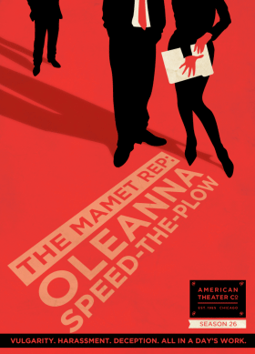
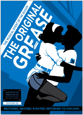
Speaking of design and Art, and Speed-the-Plow, aren’t these handsome posters for the American Theater Company’s new season? (Click on “the plays.”) If anyone knows who the designer is, let me know. (Update: DesignScout. Thanks Lance!) I will not be missing this (R-rated! sassy!) production of Grease.
mamet_small.gif
life_small.gif
meal_small.gif
grease_small.gif
Finally, check out this fantastic 1932 map of Harlem nightclubs, drawn by the cartoonist Elmer Simms Campbell. I love this for many reasons, including the appropriately prime spots for Cab Calloway and the Savoy Ballroom, and the hand-lettering is just so. Happy procrastinating!

Fresh Girls from Stockholm: Kanye Wests’s Tweets Go With New Yorker Cartoons

_Pollux writes_:
__Why girls from Stockholm be so fresh????!!!!__ Oh, I don’t know. Perhaps it’s the food that makes them so fresh: anchovies awash in sweet brine; cloudberries and vanilla ice cream; crispbread with a slice of sharp Västerbotten cheese.
Kanye West doesn’t know either, and posted his question to the world as a tweet.
Kanye, one of Twitter’s newest members, has been tweeting to his heart’s delight.
As it turns out, the rapper’s tweets “can be paired perfectly”:http://www.huffingtonpost.com/2010/08/03/kanye-west-new-yorker_n_668894.html with _New Yorker_ cartoons, like slices of Västerbotten on crispbread. The hashtag is #KanyeNewYorkerTweets. Have fun!

Triple Star: Typography’s Asterism

asterism.PNG
_Pollux writes_:
You don’t see the asterism very much. Three asterisks in a triangular or linear formation, the asterism is used in typography to indicate minor breaks or subchapters in a text.
Printers sometimes use it to call attention to a passage that follows, as explained in the fascinating book by Alexander and Nicholas Humez called _On the Dot: the Speck that Changed the World_. A terminal punctuation character, the asterism can be seen at the end of chapters, but also at the end of verses or stories.
Also known as a triple asterisk, the asterism had some other functions in past centuries.
According to Richard Taruskin in his _Oxford History of Western Music_, the asterism was used to denote an omission of some kind in 19th century typography. If the name of an author was unknown, for example, an asterism was used in place of the name.
19th century Russian music critic César Antonovich Cui used an asterism as his nom de plume (Taruskin, 311). This was because Cui had a day job that prohibited him from journalistic activities: Cui was a Russian army officer and wrote treatises on fortresses and fortifications.
How do you type the asterism? Only certain fonts support the Unicode character for the asterism, which is U+2042. According to this “site”:http://www.fileformat.info/info/unicode/char/2042/fontsupport.htm, the fonts that support the asterism include Arial Unicode MS, Cardo, DejaVu Sans, and Linux Libertine.
If you’re using Microsoft Word, click on “Insert” and then “Symbol.” In the “Font” drop-down, change the font to Arial Unicode MS. The asterism will show up under the “General Punctuation” subset, but you can also find it by typing “2042” in the character code window. Click on “Insert” or you can use the shortcut key of 2042, Alt + X. Watch it appear! Your subchapter will thank you for it.
So there’s more to the asterism than just a pile of asterisks. Its appearance seems to me a cry for love and attention. So beautiful, and so ignored. Write a “letter”:http://emdashes.com/2010/07/so-you-love-punctuation-write.php to an asterism (it may get directed to the ghost of Cui) here.

Pylcrafte: The Origins of “Pilcrow”

_Pollux writes_:
“Pilcrow” is a strange word for the punctuation mark used to signify new paragraphs. Lucy, one of the letter-writers in our ongoing contest in which you address the punctuation mark of your choice, had to look it up. We did, too. Where does it come from?
The words “pilcrow” and “paragraph” may have a common ancestor. Walter William Skeat, in his _Notes On English Etymology_ (1904), theorizes how the Latin _paragraphus_ (“paragraph”) eventually became the word “pilcrow.”
First, _paragraphus_ became corrupted as _paragraphe_.
_Paragraphe_ became _parragraffe_, to which an “excrescent t,” as Skeats calls it, was added at the end.
The variant _pargrafte_ appears in the _Ortus Vocabulorum_, a Latin-English dictionary printed in 1500 by the delightfully named Wynkyn de Worde. The variant _pylcrafte_ appears in another dictionary, the _Promptorium Parvulorum et Clericorum_.
So _pargrafte_ became _pylcrafte_.
“This is rather violent,” Skeats admits, but cites the change of r to l as a common occurrence in Indo-European languages. “Due to mere laziness,” _pylcraft_ or _pilcrafte_ became corrupted as “pilcrow.” Now you know!
Declare your love for the pilcrow “here.”:http://emdashes.com/2010/07/so-you-love-punctuation-write.php
.

Panelled Tribute: Vanessa Davis’ “Splendor”

_Pollux writes_:
“People called Pekar a curmudgeon–but I know that his brand of grumpiness comes from the truly tender-hearted.” That’s from “Splendor,” “Vanessa Davis'”:http://www.spanielrage.com/ “illustrated remembrance”:http://www.tabletmag.com/arts-and-culture/39684/splendor/ of Harvey Pekar for _Tablet Magazine_.
A lot of wonderful written tributes to Pekar have been created this week, and it is great to see homage paid in words and pictures as well.
Check out an interview with author and cartoonist Vanessa Davis at “Gothamist.”:http://gothamist.com/2005/08/01/vanessa_davis_authorcartoonist.php