Category Archives: Looked Into

The U.S.’s Bygone Angostura Autarky

Jonathan Taylor writes:
Edge of the American West has helped us catch up with the Angostura Bitters shortage of 2009–10, since we’ve been taking a bit of a break from the cocktail-shaking scene.
If only Angostura, now a division of Bacardi, were still manufacturing its concentrate for U.S. distribution in Jersey City, as it was at the time of a 1934 Talk piece about the secret recipe, protected by the evasive wiles of the then custodian, Alfredo Galo Siegert:

It takes eight months to make Angostura Bitters. “After the first four months, we do different things for the next four months,” Mr. Siegert told us in a burst of confidence.

But you don’t need fancy bitters to make an authentically pre-Prohibition mixed drink. The 1910 Siegert-sponsored Complete Mixing Guide at my elbow contains numerous recipes using the bitters, but also a ton of others, mostly with this rough structure:

WHITE PLUSH

Use whiskey glass.
Allow customer to help himself to bourbon or rye whiskey, then fill glass with milk.

Here’s to Monday! For more on alcohol in The New Yorker, see this New Year’s entry in the Back Issues blog.

Lorrie Moore’s Latest Novel: Alternate Covers, New Yorker-Style

Emily Gordon writes:
Our friend and Print contributing editor Peter Terzian showcases some of the unused covers for Moore’s novel A Gate at the Stairs (which I reviewed not long ago). And there’s a double New Yorker connection! Peter writes:

Barbara de Wilde, associate art director at Alfred A. Knopf, has designed the jackets of Lorrie Moore’s novels and story collections dating back to Like Life, in 1990. For the cover of A Gate at the Stairs, Moore’s first book in a decade, de Wilde initially contacted Daniel Hertzberg, whose illustrations she had seen in The New Yorker. “I loved the high-contrast quality of his drawings,” she says. “It reminded me of Robert McCloskey books. I wanted all those remarkable colors from Blueberries for Sal and Make Way for Ducklings–those mustards and odd greens and quirky blues.”

Go to the post to see the parallel-universe covers!

Holy Last-Minute Gift, Der Fledermausmann!

Benjamin Chambers writes:
What would have been the perfect, last-minute gift for someone on your holiday shopping list in 1966?
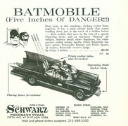
I’m betting it would’ve been the Batmobile seen on p. 185 of the October 1, 1966 issue of The New Yorker. (Click on the image below for a larger view.)

Batmobile.10-1-66-p185.jpg

I was lucky enough to own one of these (though I didn’t get it until 1971 or so), and I can attest that it was the coolest toy car ever made. I quickly lost the “rockets”, but nothing ever dulled the joy of the car’s sleek lines, the futuristic windshield, or the chain-snapping blade that would pop out of the hood.
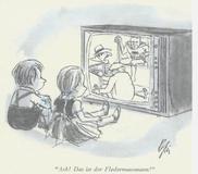
Curious to see if the Batman ever showed up in The Complete New Yorker, I was pleased to see that he did. I’ll have more to say about this at another time, but my favorite find was the Everett Opie cartoon below, from the June 24, 1967 issue. (Again, click on the image for a larger view.)

DerFledermausmann.jpg

Naturally, the cartoon made me want to look into the Strauss operetta, “Die Fledermaus,” which I’d heard of, but never seen. I was amused to learn from Wikipedia that the gist of the finale is, “Oh bat, oh bat, at last let thy victim escape!”
Priceless!

I’m Picking Out a Thermos, Filled With Snausages

Martin Schneider writes:
This is great. When our friend Ben Bass was in New York for the most recent New Yorker Festival, he told me about Michelle, this good friend of his who is…pretty much the biggest Steve Martin fan in the world, in the sweetest possible way. Even our own Emily must take a back seat to Michelle when it comes to Steve Martin adulation. And Emily really likes Steve Martin a lot.
So a while back Steve announced a fun little fan contest, to create a video for a jaunty piece of banjo music he had written, “Wally on the Run,” inspired by the frolics of his own dog Wally. The only constraint Steve imposed was that the video ought to involve a dog frolicking in some way. And…well, just go to Ben’s smile-eliciting post at Ben Bass and Beyond for the fuller story (and all relevant videos), and then come back here.
(Back? OK. Two things I feel the need to say. First, I love how Steve—perhaps the most polished TV performer of all time—even he comes off just a little dorky and wooden when he’s just shooting a quick little video for the internet. And second, I think I liked Michelle’s video better than the “Laika” one.)
I love this story. I love the internet. Good day to you.

That Thunderbird Touch

_Benjamin Chambers writes_:
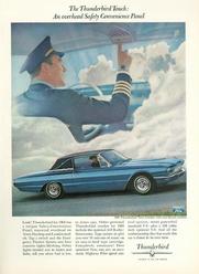
Cruising through The Complete New Yorker (TCNY) the other day—though without a unique Safety-convenience Panel—I ran across a great ad for the Ford Thunderbird on page 5 of the December 25, 1965 issue (click image for larger view):

Thunderbird-12-25-65.JPG

It’s interesting how explicitly the advertisers (Mad Men, anyone?) tried to evoke the romance and cachet of flight: the sheer novelty of having an overhead, “Safety-convenience” instrument panel was used to connote the complexity of the cockpit, and the driver was shown wearing, of all things, a pilot’s uniform. Drive this car, in other words, and you will be captain of your destiny, far from earthly cares … Hard to imagine that idea resonating with anyone today who’s flown coach.
However, I was intrigued by two of the car’s new features: the Stereo-Sonic tape system, and the “automatic Highway Pilot speed control option.” Maybe I’m showing my age, but I had no idea what Stereo-Sonic tapes were, and was surprised to learn they were 8-Track tapes. I hadn’t realized they were introduced so early. (According to Wikipedia, Ford introduced 8-track players in most of its automobile lines in September 1965.)
The mention of the “Highway Pilot speed control option” made me wonder when cruise control was first introduced. Turns out it’s been around since the 1910s (!), though the modern version first appeared in a 1958 Chrysler.
Apparently, the guy who invented the modern version did so after he got tired of the way his employer kept speeding up and slowing down when he was talking as they drove along together. Who knew that highly-useful invention was born of such deep irritation? Maybe that’s why the driver shown in the ad has no passengers. Wouldn’t want to spoil the illusion of peaceful command by including insubordinates just itching to fix your wagon …

TilleyTime: The 2010 Eustace Tilley Contest

Escher-Tilley-2.jpg
_Pollux writes_:
The 2010 Eustace Tilley Contest is “here!”:http://www.newyorker.com/online/photocontests/eustace_tilley_2010#ixzz0Zyv008QH
It will coincide with the 85th anniversary of _The New Yorker_ (huzzah!). The image of Eustace Tilley is iconic, but is open to endless modification, metamorphosis, and transmutation in this fun contest.
Some FAQs:
_When is the entry deadline?_ January 18, 2010.
_And where can I see last year’s winners?_ “Here.”:http://www.newyorker.com/online/2009/02/09/slideshow_090209_eustacetilley#slide=1
_How many Eustaces can I upload?_ As many as you want!
_What do the winners get?_ The chance to be featured in a slide show curated by the very excellent Françoise Mouly!
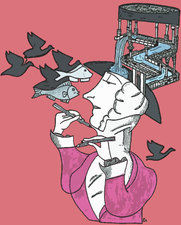
_Is the contest fun?_ Absolutely. My “Escher Tilley” above, which was fun to draw.

The Importance of Knowing What You’re Good At

Benjamin Chambers writes:
Reading some old hard-copy issues of The New Yorker dating from the 1990s, I ran across the “Postscript” piece by Lee Lorenz on George Price, from the January 30, 1995 issue.
I grew up with Price’s angular cartoons and his quirkily dry sense of humor— and since the guy did over 1,200 drawings for the magazine between 1929 and his death, many people alive today can say the same—so I was stunned to learn that “only one [of his cartoons], amazingly, was based on an idea of his own.”
What Price was good at was drawing, and so he used punchlines that were supplied for him. It wasn’t that uncommon to use gag writers, but I’d guess the frequency with which he did so was, and the way the results do seem to be so of-a-piece, as if the punchlines and the drawings really were the product of a single mind.
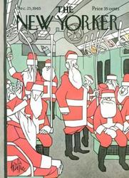
It’s telling, I think, that the one drawing that was based on his own idea was a sight gag, and didn’t have a punchline. It appeared on the cover of the December 25, 1965 issue, and can be seen below. (Click the link at left to find it on The Cartoon Bank; click on the image below to see a larger version.)
Geo-Price_TNY_12-25-65.JPG
The same 1995 issue of TNY that contained the homage to Price also featured David Owen’s profile of software entrepreneur and art patron Peter Norton (Norton Utilities, anyone?). I read the profile at the time the issue came out, and for the past 15 years, it has stood out in my memory as an excellent portrait of a bright, highly unusual man. One of the amusing things in the piece:

Nerd tycoons differ from robber barons … If there had been no such thing as petroleum, John D. Rockefeller would surely have found some other means of becoming stupefyingly wealthy. But if there had been no computers, what would have happened to guys like [Bill] Gates and Norton? Norton suspects that he might have ended up either as “an angry cab-driver with a Ph.D.” or as a paper-shuffling minion of some faceless corporation, much as his father was. The fact that big companies were beginning to use computers at the very moment Norton entered the job market was a hugely propitious accident for him— like becoming a teen-ager in the year they invented French-kissing.

“Cartoonists Are Artists”

4166418344_0b6af6d2c3_o.jpg
Emily Gordon writes:
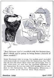
Courtesy of one of my favorite blogs, Leif Peng’s “Today’s Inspiration”–which you can, and should, get as a daily email full of vintage magazine covers, illustrations, comics, ads, and all-around cup-spiller-overs–here’s a statement with which we can heartily agree, expressed in words by Richard Taylor (writing in American Artist in October 1950) and in pictures by good old Hank Ketcham.

The Top Ten: Algonquin Round Table Power Rankings

_Pollux writes_:
Jillian Lovejoy Lowery and Howard Megdal come up with unscientific “rankings”:http://perpetualpost.com/?p=3654 measuring the greatness of the members of the Algonquin Round Table.
Some of these stars have dimmed since their heyday, and Lowery and Megdal discuss whether Alexander Woollcott, for example, deserves to be “buried by history” or whether Franklin P. Adams deserves his current obscurity. Dorothy Parker is no. 1 on both posted lists.
Emdashes readers, post your own rankings here!

Tears of a Clown: The Anti-Comic Sans Movement

_Pollux writes_:
We continue our “coverage”:http://emdashes.com/2009/04/the-plague-of-our-time-the-ban.php of the odium aimed at the font everyone loves to hate. No, not you, “Take Out the Garbage.”:http://www.dafont.com/take-out-the-garbage.font I mean of course Comic Sans.
Cameron Chapman, on the blog Six Revisions, “writes”:http://sixrevisions.com/graphics-design/comic-sans-the-font-everyone-loves-to-hate/ about why Comic Sans is hated so much, and shows some interesting visual examples of when the font has been used inappropriately. Chapman mentions that Comic Sans has seen wide and inappropriate usage, from a sign for a bone marrow transplant clinic to a grave marker.
Chapman also offers some alternatives to Comic Sans, like “Lexia Readable.”:http://www.k-type.com/?p=520 In the meantime, Comic Sans remains at large. Emdashes has committed an additional 30,000 typographers to address the problem.